
If you want to deliver a fantastic presentation, use diagrams to make your data appear more intuitive and assist your audience in understanding the analytics and gaining insight. Venn diagrams are an old classic- that still prove to be tremendously useful in comprehending complex ideas. These can be used in a variety of analytic situations
What Is A Venn Diagram?
A Venn diagram is a representation that utilizes shapes to depict the relationships between objects or finite groups of things. The idea is very simple: shapes that overlap share properties, while those that do not overlap carry dissimilar properties
Venn diagrams are a class of infographics that are commonly used in set theory. They mostly demonstrate how to group one or more components bounded by a line so that the elements of each group remain inside.
Benefits of Using Venn Diagram In Your Business Presentation
Like any other illustration, the Venn diagram has its own distinctive property that we must comprehend to interpret and analyze the data given in the diagram correctly.
Here are some significant benefits of using a Venn diagram in your presentations:
- It demonstrates data.
- It depicts the relationships and connections that exist between two or more groups.
- It’s basic and easy to create.
- It improves the visual appeal of a presentation.
The objective of these diagrams is to highlight how elements in a particular field related to one another. Venn diagrams are an amazing technique to clearly and efficiently visualize data and information. This is what makes a Venn diagram so effective in presentations.
Here is a step-by-step guide to creating a professional Venn diagram in Google Slides.
How To Create A Venn Diagram In Google Slides?
Step 1 – Create a circle by selecting the circle shape from the menu.Insert > Shapes > Circle
Step 2 – Duplicate the circle and adjust them accordingly.
Ctrl + D
Step 3 – Fill the colors in the circles as per your choice.
Step 4 – Go to the Custom option and lower the transparency of colors.
Custom > Transparency
Step 5 – Create a text box and add text to your Venn diagram.
Step 6 – Adjust the text position and set the text color as you want.
Venn diagrams can make your presentation more visually appealing and easier to grasp. If you’ve ever used Google Slides to create a presentation, you’ll know that any diagram is preferable to plain text, which is dull and loses the audience’s interest by the second or third line.
If you are confused about how to create a Venn diagram in Google Slides, you can check out this amazing video tutorial dedicated to the same.
If you are a business professional who struggles while creating well-organized business presentations, then we have the ultimate solution for you. Check out our fantastic collection of Venn diagram presentation templates that are easy to use and highly customizable.
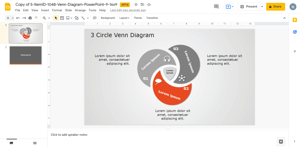
3 Circle Venn Diagram
Source: 3 Circle Venn Diagram by SlideUpLift
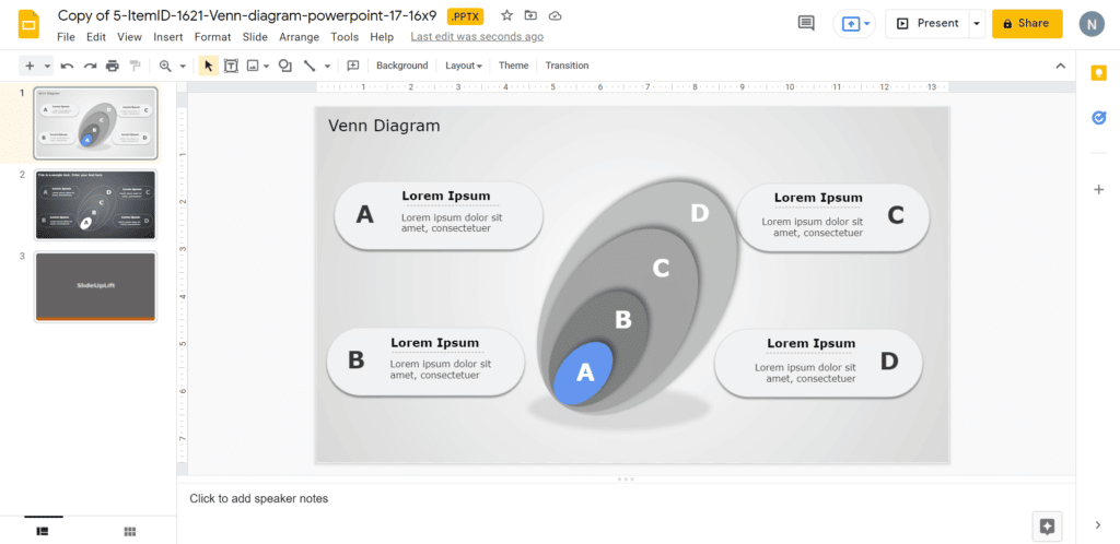
Venn Diagram
Source: Venn Diagram by SlideUpLift
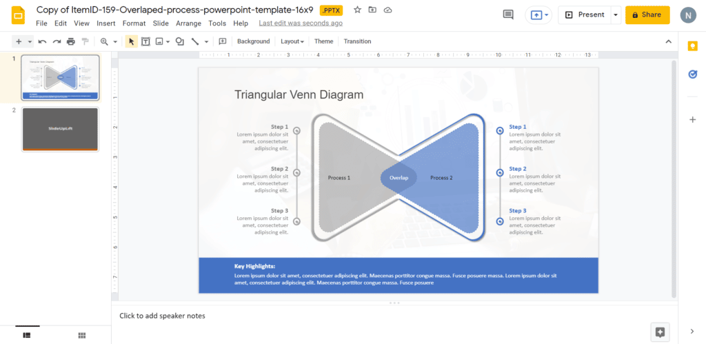
Triangular Venn Diagram
Source: Triangular Venn Diagram by SlideUpLift
4 Circle Venn Diagram
Source: 4 Circle Venn Diagram by SlideUpLift
Now you don’t have to scour the web to find out the right templates. Download our PowerPoint Templates from within PowerPoint. See how?
Looking For Powerpoint Design Agency?
Call Pursho @ 0731-6725516
Telegram Group One Must Follow :
For Startups: https://t.me/daily_business_reads
#Create #Venn #Diagram #Google #slides
")
 in 2026")