Two sides of the same coin
Minimalism and maximalism have always co-existed. There are those who like more and there are those who like less. The words describe just about any facet of design or even lifestyle, but when it comes to presentation design, there’s merit with both minimalism and maximalism.
The long reign of minimalist design
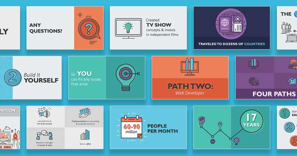
When we discuss the look-and-feel of a presentation with a new client, it’s not uncommon for them to request that it ‘feels like Apple.” As designers, we know what this means: keep it simple and fresh. Apple has perfected minimalism within the digital scene for decades. As a result, a lot of lesser-known companies are hanging on tight, following suit, and hoping they don’t get left in the dust. But that’s not necessarily a bad thing. Minimalism forces a company to hone in on its core message to the world; what’s important, and what’s just fluff.
Minimalism in presentations
Designing a presentation in a Minimalist fashion is a hyper-organized process. It’s all about finding common denominators.
First, you always start from a reference point. Typically, that’s either brand guidelines or previous work that’s well-received. Already, a lot of questions are answered such as what fonts to use, colors, icon styles, etc. With minimalism, what you create now dictates what’s created later, so you’re never having to start from scratch. As a result, you end up tackling the heavy-lifting first to pave the way for more work down the road.
 For presentation design, minimalism makes A LOT of sense A LOT of the time. Here are some highlights:
- Messaging is clear and concise
- What’s on the slide has value, not just the speaker’s notes on the screen
- Content-heavy slides are broken up into bite-size chunks
The rise of maximalist design
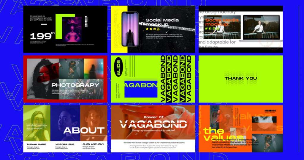
What’s fascinating is the amount of traction maximalism is gaining. And it’s not slowing down. If minimalism’s mantra is, keep it simple, keep it fresh, maximalism’s mantra is, SAY IT LOUD, SAY IT PROUD. With maximalism, daring color schemes and absurd scale replace white space and grid layouts. The lack of rhyme or reason becomes the foundation of the maximalist’s look-and-feel. It’s CHAOTIC, it’s FUN, and it’s NOT BORING. This style shines for people and companies already in the creative world. For example, musical artists, design and marketing firms, and thought leaders can benefit from maximalist principles. Ultimately, it’s about making an impact.
Maximalism in presentations

Already, we see Keynote templates using maximalist design, like the one above from Behance. Now it doesn’t take a BFA degree to make the connection that not all presentations should look like this, (though it would certainly spice up that quarterly financial review slideshow.) Regardless, it’s captivating and confident, which we’re all about here at Ethos3.
Minimalism vs. maximalism
The bottom line is there’s a time and place for both minimalism and maximalism within presentation design. Not to mention, there’s no rule saying you can’t take elements of one and mix them with elements of the other. And at the end of the day, we’re super excited to see brands take a step back from what the ‘experts’ are doing and reinvent themselves in bold and unique ways.
Find out how Ethos3 can help you maximize your presentation prowess today.
The post Mimimalism and Maximalism: Two Presentation Design Options appeared first on Ethos3 – A Presentation Training and Design Agency.
Looking For Powerpoint Design Agency?
Call Pursho @ 0731-6725516
Telegram Group One Must Follow :
For Startups: https://t.me/daily_business_reads
#Mimimalism #Maximalism #Presentation #Design #Options


