
After sifting through countless organizations’ annual reports, landing on Mailchimp’s 2020 report was a jarring experience, to say the least. I felt my brain yanked out of the drabness and monotony of corporate data reporting and thrown into a psychedelic Blues Clues-like world of color and interactivity. Needless to say, their annual report design is superb.

Grow your business with marketing automation
But the report isn’t just fun and creative—it also tells a story. It says, “Not only are we confident in our performance and our brilliant communication, but we also care deeply about our customers and the world at large.” How does it do this? Through bold, colorful statistics about employee benefits and the company’s social justice efforts.
The primary purpose of an annual report is to analyze your organization’s performance over the year, but it’s also an opportunity to share your brand’s identity with stakeholders, whether those be customers or investors. After looking through dozens of reports, I unpack my favorites below, as well as how to live up to their caliber.
7 captivating annual report examples
The following organizations have proven that annual reports aren’t just a bunch of numbers to nod and smile at.
1. 2021 Everlane Impact Report
For sustainable fashion retailer Everlane, it’s just as important to communicate ethical goals and accomplishments as it is to report on financial success.
The company’s 2021 impact report is all about transparency. It holds itself accountable to its commitment to sustainability by illustrating how its processes make up its carbon footprint. While this opens the door to criticism, honesty goes a long way in the sustainable fashion industry.
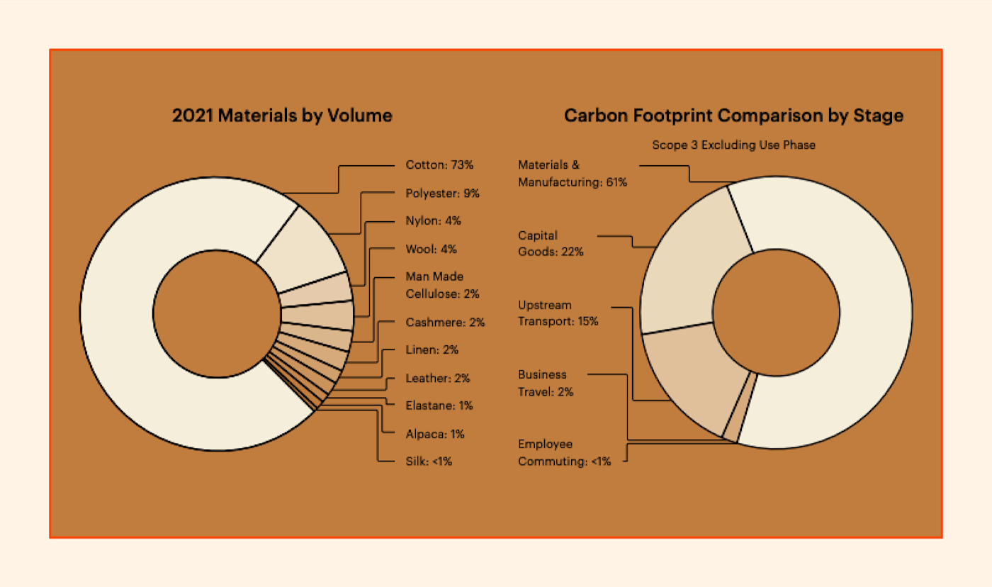
From a design perspective, natural tones dominate the report, echoing the brand’s commitment to eco-friendliness. No hot pinks or neon turquoises in sight—just forest greens, ube purples, earthy browns, and other natural tones. Overall, the report successfully models how to use design to communicate brand image.
Takeaways:
-
If your brand is committed to an ethical cause, be transparent about how you’re tracking toward that cause.
-
Keep your color scheme consistent with your brand image.
2. The Trevor Project’s 2020 Annual Report
The last thing an annual report should be is wordy and difficult to digest. In its 2020 report, The Trevor Project—the world’s largest LGBTQ+ crisis intervention and suicide prevention organization—includes statistics and valuable information about its efforts while keeping things clear and succinct.
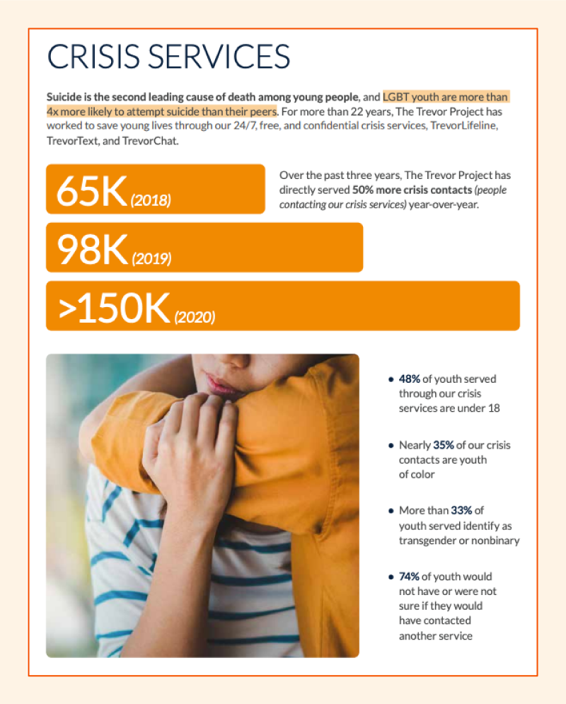
The report uses large headers, bullet points, highlights, and strategic bolding to present how they’re working to innovate, educate, and advocate for young members of the LGBTQ+ community.
Not all data evokes sunshine and butterflies, and The Trevor Project’s report uses a clean, streamlined design to keep the focus on what matters most to them.
Takeaways:
-
Keep copy light and succinct wherever possible.
-
Call attention to your most important points through bolding, headers, and bullet points.
3. Mailchimp’s 2020 Annual Report: Against All Odds
Nobody does interactivity quite like Mailchimp. Their 2020 annual report feels like a video game, with the screen moving horizontally rather than vertically as the user scrolls. It even integrates hidden mini-games for the user to play. (I found the game with the cat fighting the evil vending machine to be harder than it looks.)
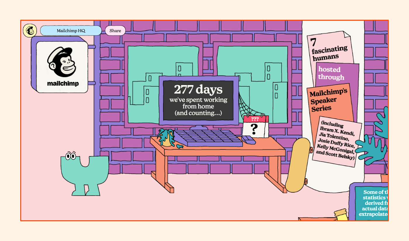
The report highlights the company’s success statistics, philanthropic efforts, fun facts, and some customer case studies, creating unique colorful worlds for each of these sections.
Mailchimp is known for innovative communication solutions, and their annual report design is no exception. Overall, the company reminds us that business and fun don’t have to live in totally separate realms.
Takeaways:
-
Implement interactivity to keep your readers engaged.
-
If doing so aligns with your brand image, creatively convey data using color and animation.
4. USAA’s 2021 Annual Report to Members
USAA provides military families with insurance, banking, and retirement assistance, among other forms of support. There’s a lot to take away from their 2021 annual report.
The report’s Business Snapshot page is inspiring and professional, using large text and bolding to communicate some of the organization’s must-know stats from the year. Even if you didn’t read the text on the page, the color scheme alone makes it clear that USAA is a military-serving institution.
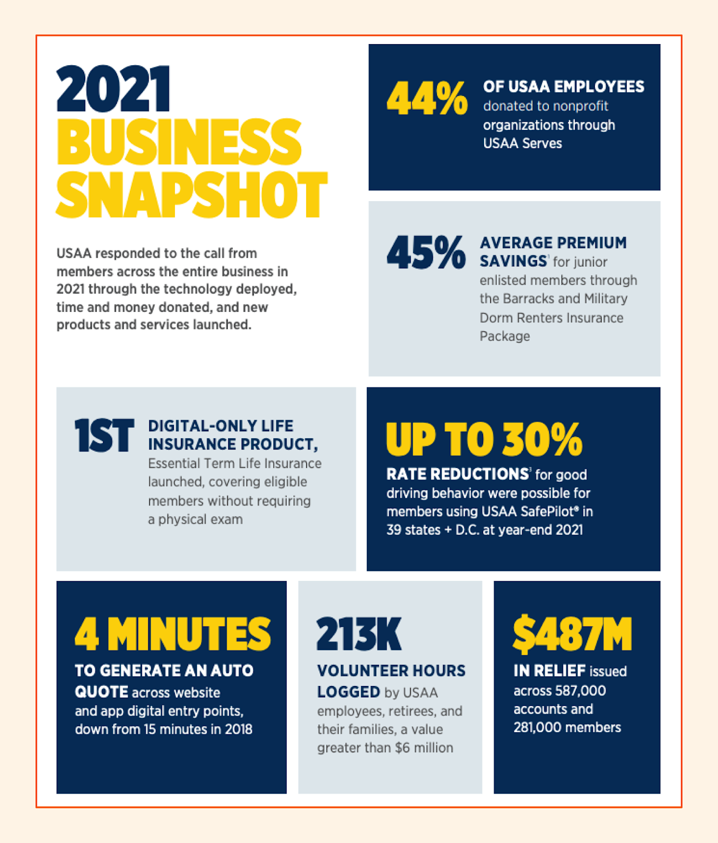
The report also includes a timeline walking through how the organization has grown over a century—a feature that, for obvious reasons, makes an impact. Not too many brands can boast a hundred years of serving their customer base.
The report’s imagery evokes an emotional reaction, depicting tender moments between servicemembers in uniform and their families. All in all, the report’s endearing photography, bold typography, and use of colors associated with the military (like deep navy blue) effectively communicate USAA’s mission.
Takeaways:
-
Let your design speak for itself by choosing fonts and font colors that embody your mission.
-
If your organization has a long history, use that to your advantage with timelines.
5. adidas Annual Report 2020
With a simple and lively user interface reminiscent of Apple’s dramatized product releases, adidas’s 2020 annual report is bold and proud. The report’s minimalistic wording and huge statistical callouts communicate, “We have nothing to hide.”
The user’s entire browser transitions with every scroll, each view summarizing a key takeaway and offering a link to additional details. This keeps things simple for the user while still making all important information easily accessible.
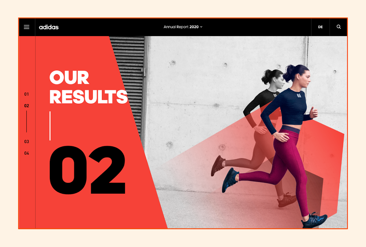
To level up user experience even further, the report offers a chart generator where users can select the metrics they want to see and customize how they view them.
Adidas is known worldwide for its influence in the athletic footwear and clothing industry, and its report’s bold use of red and black as well as its moving imagery echo this reputation.
Takeaways:
-
If relevant, include photography of your audience or market.
-
Get creative with UX both in your report’s landing page interface and in any supplemental tools you share.
6. Google Diversity Annual Report 2022
When looking for design and tone inspiration, Google rarely fails to impress. While not a traditional annual report, Google’s 2022 Diversity Annual Report is reflective, inspiring, and human. These qualities show up most prominently in the company’s voice and tone—for example, the report opens with a conversational and humble statement: “We’re growing to meet people where they are.”
You may think that Google, being one of the most successful tech giants in the world, doesn’t have much growing to do. But their report’s tone suggests they do—and they’re working to improve every day.
Much like adidas, Google summarizes its most important efforts and wins while offering a link to a more extensive PDF report. Through and through, the report is clean and easy to digest.
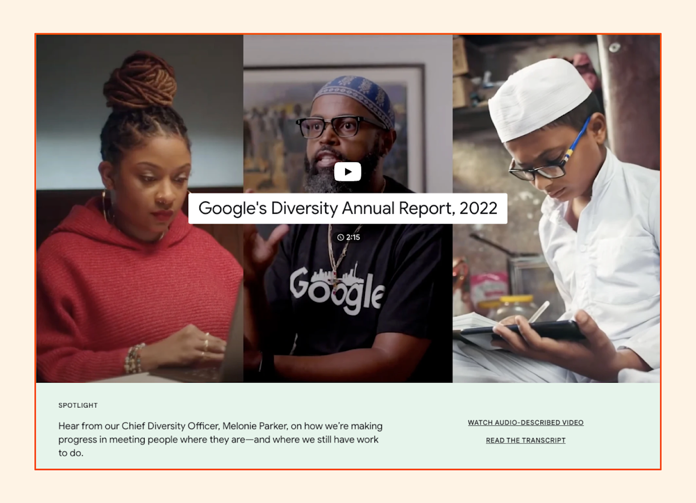
In a unique take on the letter from leadership, Google’s report embeds a video in which Chief Diversity Officer Melonie Parker discusses the company’s progress in hiring and creating products with diversity in mind.
Overall, the report’s clean, clear, and data-driven design speaks to the company’s mastery of technological expertise and human communication alike.
Takeaways:
-
Keep your voice and tone consistent with your brand image while aiming to sound human and approachable.
-
Use creative content formats (like videos) to communicate with your audience.
7. Conservation International’s 2021 Annual Report
I encountered a lot of lively, optimistic annual reports in my search. Conservation International takes a very different approach in their 2021 report—what you may call a “doom and gloom” approach—but it works.
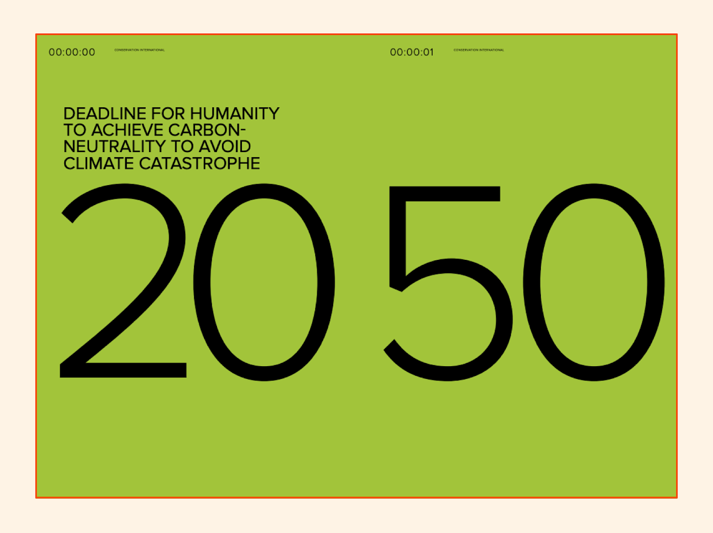
The report’s cover reads “Not a moment to lose,” followed by the deadlines that the world has to get its act together. In a brilliant continuation of this theme, the report shows page numbers in a digital stopwatch format, as if each page represents a second in the countdown toward climate disaster.
Anxiety inducing? Yes. Effective? 100%.
The report also incorporates breathtaking photography of nature and wildlife, showcasing what the organization aims to protect.
Takeaways:
How to design an annual report
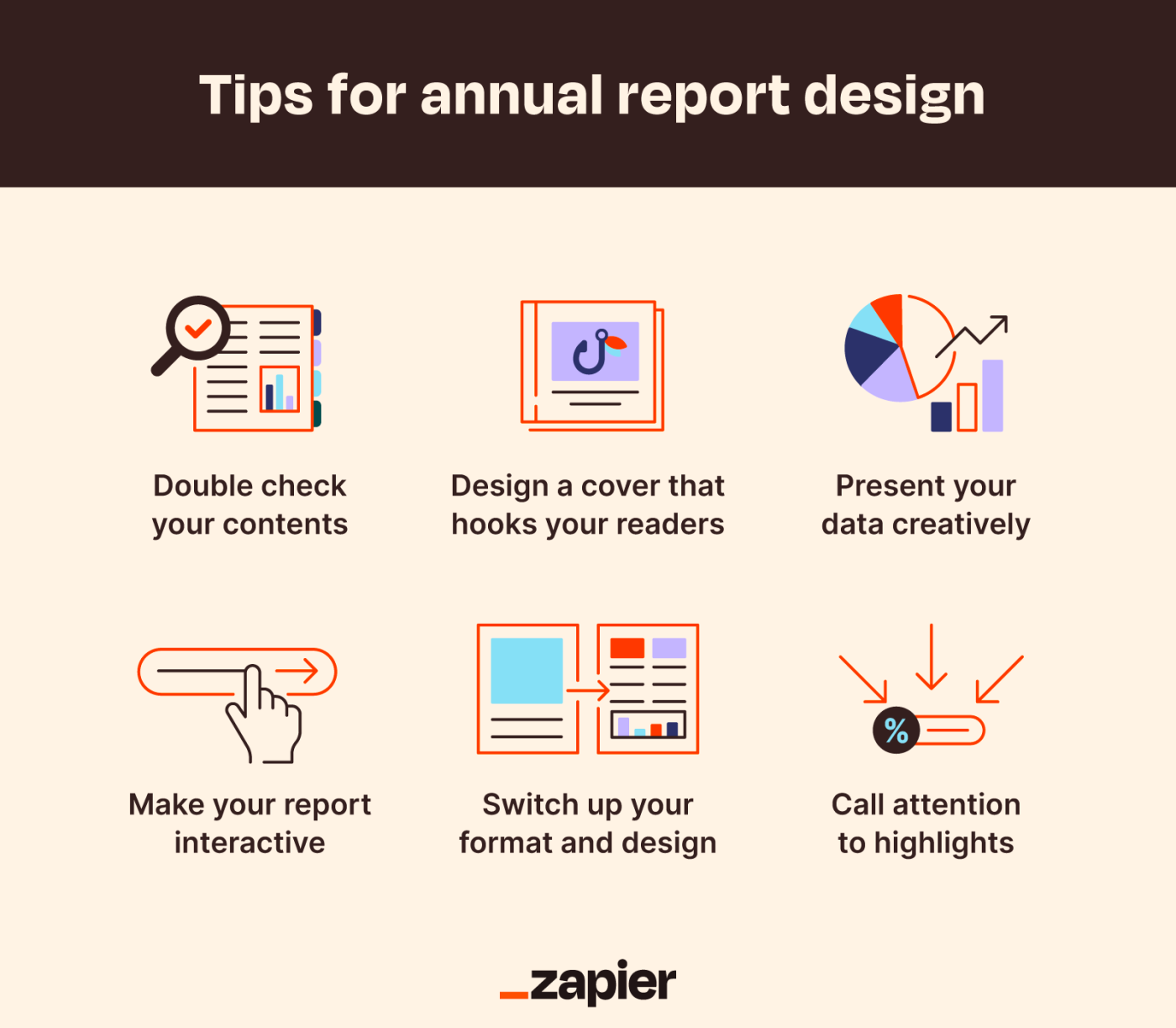
If you want to impress your audience with your annual report, you can’t cut corners. Here are some tips on how to live up to the above examples.
1. Include all relevant sections
Before worrying about your report’s look and feel, confirm it contains the following sections:
-
Letter from the CEO or other leaders: This is leadership’s opportunity to briefly tell stakeholders your organization’s story and summarize some key wins, as well as what’s to come moving forward.
-
Table of contents: Annual reports tend to be 30+ pages long, but nobody has time to read an entire report from cover to cover. Make things easier for your readers by including navigation like a menu or a table of contents.
-
Organizational overview: Hopefully, you spent more than five minutes developing your organization’s mission statement. Now’s your time to share some highlights about who you are and what you do with your stakeholders.
-
Performance discussion and analysis: Data visualizations are key here. You don’t want your stakeholders falling asleep at their desks as they try to interpret a wall of copy and numbers describing your organization’s performance.
-
Financial summary: Every annual report should include the organization’s financial statements, breaking down your profits or losses over the year for stakeholders and potential investors.
If you have testimonials or case studies you can add to your report, all the better. While not necessary, concrete proof of your organization’s success goes a long way when it comes to securing investor support.
2. Captivate with the cover or landing page
Your report’s cover should tell a visual story that grabs the reader’s attention and sets the tone for the rest of the report.
While many of the above reports execute this well, I’d argue Conservation International’s cover takes the cake. It ropes readers in with nothing short of a stark warning, then proceeds to lay out what they’re doing to protect the Earth (and what still needs to be done).
Many organizations also include a landing page that summarizes some of their most important achievements and data points from the past year. From this page, the user can click a button to download the organization’s full report. Everlane’s impact report landing page does a great job of stating its mission upfront, using large headers and bold statistics to grab attention, and keeping copy light.
3. Include data visualizations
Even educated professionals and subject matter experts prefer organized, color-coded charts and graphs to numerical data that reaches the nth row of an Excel spreadsheet. This holds especially true for potential investors who may know very little about your industry.
Don’t be afraid to branch away from traditional data visualization formats—not everything needs to be a bar or pie chart. Integrate maps, flowcharts, 3D graphs, and other creative methods of communicating through design. Employ your organization’s graphic design expertise to make your data digestible. If you don’t have any in-house experts, source help from a third party.
Of course, it’s important to implement data visualizations in moderation and to add context to the ones you include, keeping your report readable and accessible to everyone.
4. Implement interactivity
Have you ever listened to a tour guide talk about an exhibit for 20 minutes without asking the audience any questions? I almost have, but I fell asleep after 15.
When something encourages action, it’s more likely to hold a user’s attention. Mailchimp’s report integrates a moving character, pop-ups, clickable elements, and mini-games to keep the user scrolling and engaged.
5. Bring attention to what’s important
An annual report’s format and structure should call attention to its key points. Your goal shouldn’t be to fill every bit of white space with text. Add a summary page before each section highlighting what’s to come. Use large fonts, color, and bolding to call attention to your organization’s most impressive stats.
6. Surprise your readers
While stylistic consistency is important, don’t be afraid to mix up your formatting frequently throughout your report. A sudden color shift, a fresh new data visualization, or a cover page with a lot of empty space can keep readers engaged and wondering what’s to come. Nobody likes a boring report—surprising elements can add some excitement while still telling your brand’s story.
7. Find your angle
Nobody likes a copycat. While other organizations’ great annual reports can serve as excellent inspiration, you shouldn’t try to directly replicate them. You have a unique audience (that isn’t Mailchimp’s audience or adidas’ audience)—figure out what’s important to them and meet them where they’re at.
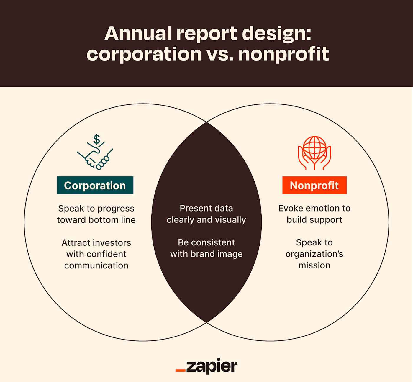
For example, your annual report design will look different if you’re a nonprofit than if you’re a corporation. Nonprofits are heavily mission-focused and should aim to fundraise with their annual report design, perhaps using emotional imagery and inspiring goals. Corporations, on the other hand, should center their reports around their progress toward profit goals and should command the attention of investors.
Apart from what type of organization you are, remember to leverage your strengths in your report. Do you have a long history like USAA does? A timeline of your progress over the years could be a powerful visual. Do you operate in several countries? Consider adding a map that illustrates your expansiveness.
Annual reports pose an opportunity to get creative with how you communicate your brand’s identity, but they also serve an important purpose: impressing your audience. As you get started, remember to strike a balance between creativity, content, and clarity.
Concerned you don’t have what it takes to design a great report? Check out our post on developing your design skills.
Need Any Technology Assistance? Call Pursho @ 0731-6725516


