
A great presentation is always a balance of what you hear (the message the speaker delivers) and what you see (the presentation media used to enhance the message). Today we’re talking about what you see—the presentation design–where there is always more than meets the eye. Really, presentation design has 2 important layers of meaning. Take a minute or so to watch this video called “words” for a great example.

Words from Enle Li on Vimeo.
Pretty cool, right? This video is a simple and beautiful reminder of the power of visual rhetoric and how it can make us both think and feel. That’s what we want to cover today: what visual rhetoric is and how it gets its power from 2 layers of meaning.
What is Visual Rhetoric?
Visual rhetoric is the study of how we get meaning from what we see: pictures, graphics, fonts, design elements, etc. Visual rhetoric tells us that what we put on our slides isn’t just informative, it’s persuasive. These are the 2 layers of meaning working in our presentation media. Marcel Danesi explains it really well in the 2017 article “Visual Rhetoric and Semiotic”:
“The picture of a lion, for instance, can be read at two levels. Denotatively (or literally) it is interpreted as ‘a large, carnivorous, feline mammal of Africa.’ This level conveys informational or referential meaning. But the image of lion in, say, an advertisement or music video invariably triggers a connotative sense—namely, ‘fierceness, ferociousness, bravery, courage, virility’ . . . So, the image of a lion in, say, a logo design for men’s clothing would bear rhetorical-connotative meaning and affect the way in which the clothing brand is perceived.”
This leads to two important considerations for any graphic designer:
What is my design saying on an informative/denotative/cognitive level?
What is my design saying on a persuasive/connotative/emotional level?
Let’s break those layers of meaning down further.
Layer 1: What is my design saying on an informative/denotative/cognitive level?
The elements in layer 1 of your design are providing the information the audience needs to understand your message. Perhaps it’s a map with the location of your business circled. Or it could be the contact information audience members can use to reach you. It could also be statistics and data that support your research findings or survey results.
These elements in your slide deck provide what the audience members need to know. But they present it in a visual format that either reinforces or repeats the message you are verbally presenting. When designing your slide deck, these are important elements. Always begin by asking, what does my audience need to see in order to fully understand what I’m saying?
Layer 2: What is my design saying on a persuasive/connotative/emotional level?
The second layer of meaning in visual rhetoric involves more of what you want the audience to feel. This involves using design elements like pre-attentive attributes to focus your audience’s attention. It means using color psychology to guide your listeners’ emotional responses. And it means understanding the underlying meaning that all visual elements contain. Even fonts communicate on an emotional level. As Typographic Web Design says: “The aesthetic and emotional associations readers have with fonts are social constructs. Readers expect wedding invitations to use script fonts, just as they know how to dress for such occasions. On an intuitive level, they also know they shouldn’t see the Declaration of Independence or the U.S. Constitution in Comic Sans.” So much of this level of meaning is intuitive. But it can help you to intentionally explore this layer of visual rhetoric.
Honing Your 2nd Layer of Meaning Skills
Here’s a good way to start building your “2nd layer of meaning” visual rhetoric skills. Head over to the inspiration page of any major presentation media program. (We’re using Canva’s advertising presentation templates for this example.) Then, pick out a couple templates and start to explain the mood or feeling you get from each design. You might find yourself using words like modern, fun, soft, hard, minimalist, or serious. Once you have some words that explain how the presentation makes you feel or how it sets the tone for what kind of message you can expect, figure out what about the design persuaded you to feel that way.
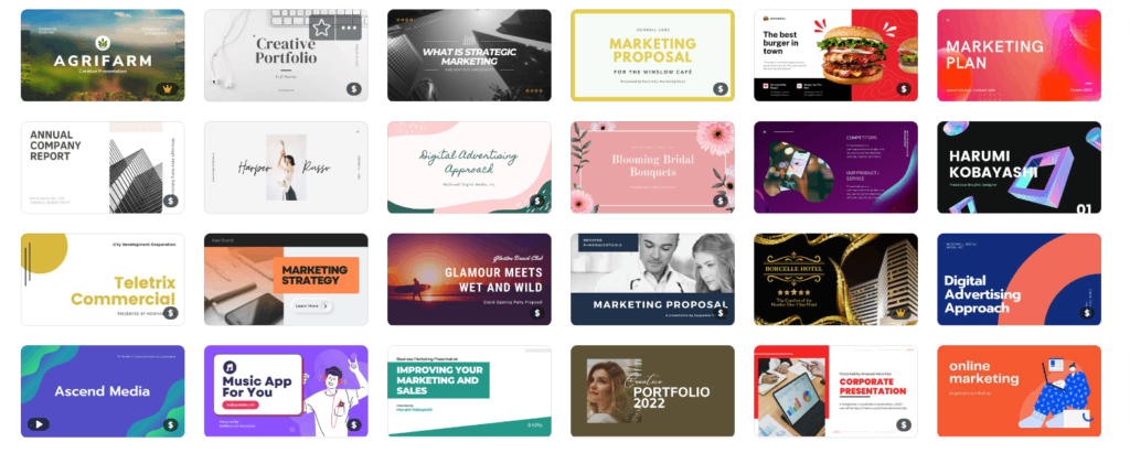
Let’s walk through an example. We’ll use the hamburger presentation that the second from the right on the top line. The design seems fun, like it won’t be a boring business presentation. I get the feeling that the content might be a bit out-of-the-box. The design elements that made me feel this way are the large 3D image of the burger, the contrasting colors, and the decorative flourishes above the burger.
Now that you understand what visual rhetoric is and how it functions on 2 important layers of meaning, you can elevate the design of your presentation.
Ready to learn more about how Ethos3 can help with your presentation needs? Get in touch with us now.
The post The 2 Layers of Meaning in Presentation Design appeared first on Ethos3 – A Presentation Training and Design Agency.
Looking For Powerpoint Design Agency?
Call Pursho @ 0731-6725516
Telegram Group One Must Follow :
For Startups: https://t.me/daily_business_reads
#Layers #Meaning #Presentation #Design

