
Any time I click publish on a landing page, I know it’s not actually finished. As soon as that page goes live, I’m already thinking about what I could do to make it better. How can I optimize the page to pull in more visitors? What new elements can I add to see if we can improve conversions?

Managing a successful landing page involves constantly testing new ideas, keeping an eye on the data, and adapting to whatever seems to resonate with your target audience. It’s the real beauty (and stress) of online marketing.
As you work on your next campaign, here are some landing page ideas, along with examples of marketers doing something similar.
7 landing page ideas for your next campaign (with examples)
The pages below have more than a well-placed CTA. Take a look, and see which elements from these landing page examples might translate well for your own purposes. (Note: some of these examples come from home pages, but the tactics will work just as well for your landing pages.)
1. Go big with video
As a writer, this is something that’s tough to admit: sometimes, copy just isn’t enough. I’ve grown to accept that using video on landing pages can really fill gaps, helping you communicate messages and ideas where copy, images, or illustrations fall short.
There are a few different ways you could go about adding video to your landing pages.
-
You could embed a product or how-to video to show your product in action and bring a few use cases to life.
-
You could use a testimonial video to add some social proof.
-
You could even turn the entire background of your landing page into a video. With health and fitness businesses, for example, communicating the right energy and atmosphere is key to pushing visitors over that line, and in-your-face video is the perfect way to do it.
Here’s a great example from Row House. And another from Psycle in London. I’m not even going to embed them because you won’t get the full experience. Go ahead and click—then tell me you still think your copy would be just as impactful.
2. Offer something for free
Sometimes, a free trial of a product or service isn’t enough to push prospects to hit that CTA. If you expect a fair bit of commitment from your customers (a substantial monthly fee or annual contract, for example), you might need to go a step further. Give them something for free—and do it on your landing page.
If you’re a B2C business, a free sample of your product will go down a treat. If you’re B2B, think about offering something that you know will be of value to your target market, like an eBook or an insights report—any sort of lead magnet is a great start.
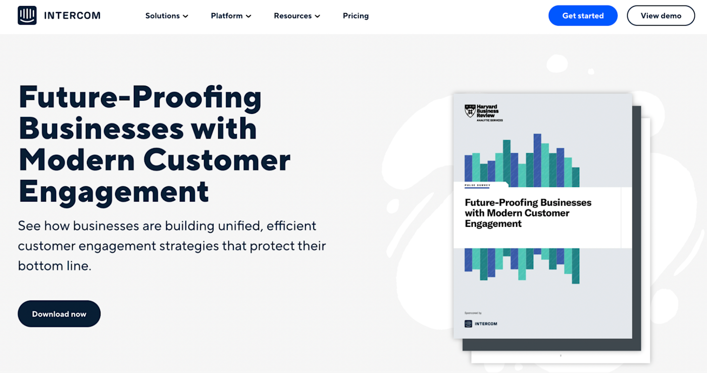
Take this example free report from Intercom. That line “See how businesses are”‘ tells me instantly that I’m going to get a lot of value from this report: customer data insights that will tell me what my business is missing out on. It’s enough to make me click that download button—and just like that, I’m a lead in their system.
Another great example is HubSpot’s website grader. Add your website URL into the tool, and it will give you an overall score and highlight any potential areas of your website that aren’t performing well. “Oh, and did we mention we offer websites as part of your HubSpot package?” It’s the perfect foot-in-the-door technique.
3. Add social proof
We all know social proof works. Studies have shown it, and the fact that you’ve never bought anything without reading a review first shows it. So it’s no surprise that adding social proof to optimize landing page can increase conversions.
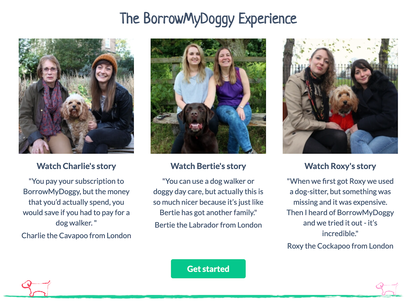
The example below from dog-walking marketplace Borrow My Doggy shows how convincing this technique can be. Here, you have pictures of real customers along with reviews that address the most common buyer questions and objections. This kind of social proof does all the selling for you.
Social proof can come in all sorts of ways: reviews, testimonials, quotes, photos—the list goes on. If other people like what you’re trying to sell, a landing page is the right place to show that off.
4. Integrate a social media feed
If your customers are so engaged with your brand that they actually take the time to post about you on social media and tag you, you know you’re doing something right—and integrating a social media feed on your landing pages is social proof gold. It’s raw, unfiltered community showcasing that screams, “you’re going to love this brand as much as we do.”
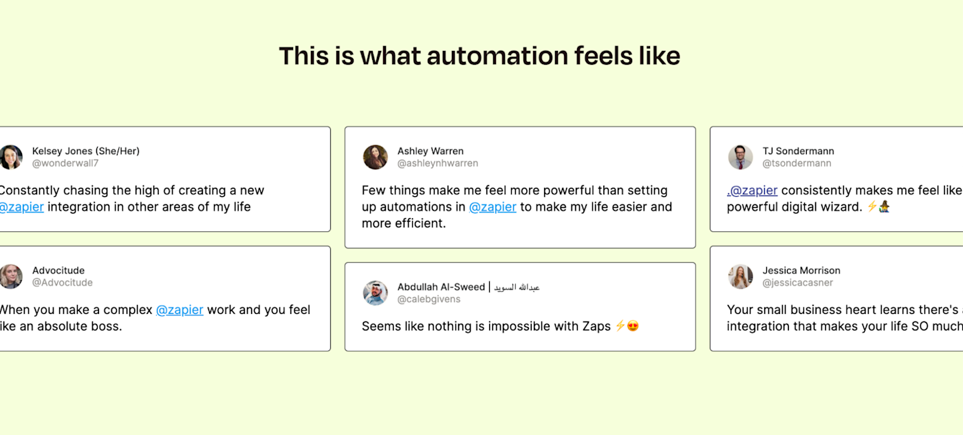
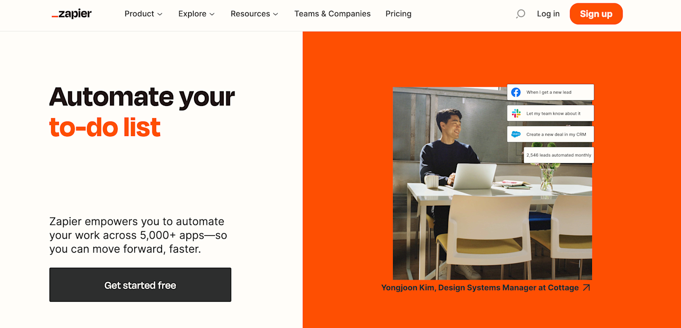
It works so well that lots of brands actually put it on their home page. Here’s Zapier.
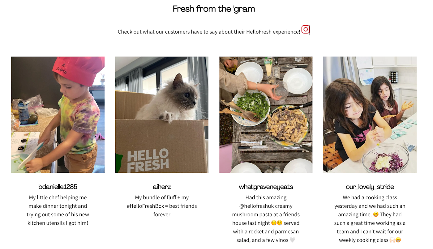
HelloFresh does something similar. They’ve built a really strong online community through Instagram by encouraging customers to take pictures of their HelloFresh dinners and post them using the hashtag #hellofreshsnaps. Using that Instagram UGC on your landing page is icing on the cake.
5. Use geolocation to personalize your pitch
A while ago, I visited Neil Patel’s website (to use his free website analyzer tool, incidentally), and something caught my eye in the copy…
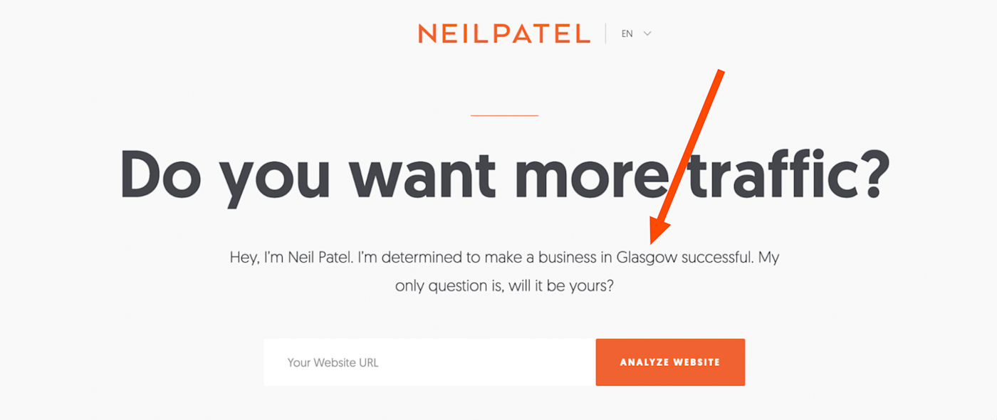
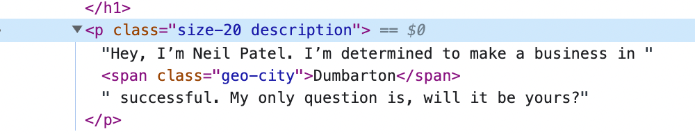
It’s a subtle detail, but I’m a sucker for personalization. Seeing “businesses in Glasgow” (where I live) in the copy makes me feel like I’ve come to the right place. Just by adding a geolocation span class to the HTML, Neil has created a tailored experience for anyone who lands on the page.
It’s subtle, but there’s no denying it’s effective.
Here’s another example from Airbnb. They use geolocation data to automatically generate a potential monthly earning for you if you were to rent your property through the service.
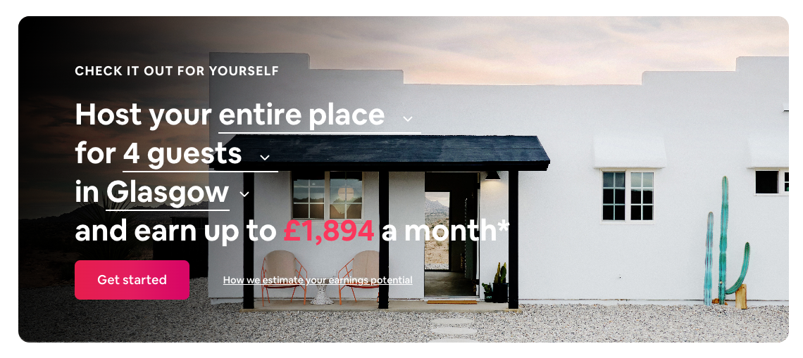
I’d never even considered renting my apartment through Airbnb; I was only on the site to book accommodation for a trip to Prague. Now, all of a sudden, I’m seriously considering becoming a host and moving in with my parents to make some cash. See if your landing page builder offers geolocation options, and you might have the same impact.
6. Use images of real people
Adding images to your landing pages does one of two things. Either it enhances a visitor’s experience of the page, or it distracts them from performing the action you want them to take. So getting the formula right with your landing page images is pretty important. A recent study found that adding images of real people to a landing page increased conversion rates by 95%.
But note that distinction: real people. Visitors can tell if you’ve used stock images of people who aren’t really invested in your brand, and that has the opposite of the intended effect: it reduces trust (and conversions).
To use Neil Patel as an example again, his picture appears on almost every page of his website.
Here’s a nice example from Zapier too. That’s a real Zapier customer—and Zapier basically tells you as much in the caption.
7. Add a secondary CTA
We all know the rules when it comes to adding CTAs to landing pages: use one, keep the copy short, and make sure it encourages quick action. But sometimes, a prospect will hit your landing page, and they’re not quite ready to “sign up” or “join now.” Why should you lose that prospect completely just because they’re not sales-ready?
I’ve noticed a lot of big brands breaking the CTA rules in a way that totally makes sense. They’re adding secondary CTAs to landing pages to capture those colder leads, so they can warm them up later.
Take this example from Canva. While both CTA options involve using the design software for free in some capacity, Canva has likely learned that free trial CTAs don’t always get clicks: people think there might be a catch (do I have to provide my card details, for example, and will I automatically be charged once the trial runs out?). In contrast, “Get Canva Free” is loud and clear.
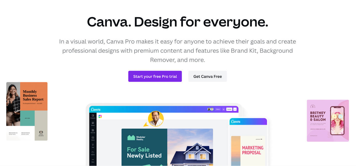
The colors of the buttons ensure that the secondary CTA doesn’t overshadow the primary one, but adding that option to the page will undoubtedly improve conversions.
This is why it’s so important to constantly A/B test your landing pages with different CTA options to see what resonates with our audience. Sometimes, you find that breaking the rules is exactly what your website visitors want.
Whatever route you decide to take with your landing page (for now, at least!), just be comfortable with the fact that some ideas might not resonate with your target audience. And that’s ok—it’s important to take those risks. Otherwise, how will you learn what your prospects really want?
Need Any Technology Assistance? Call Pursho @ 0731-6725516


