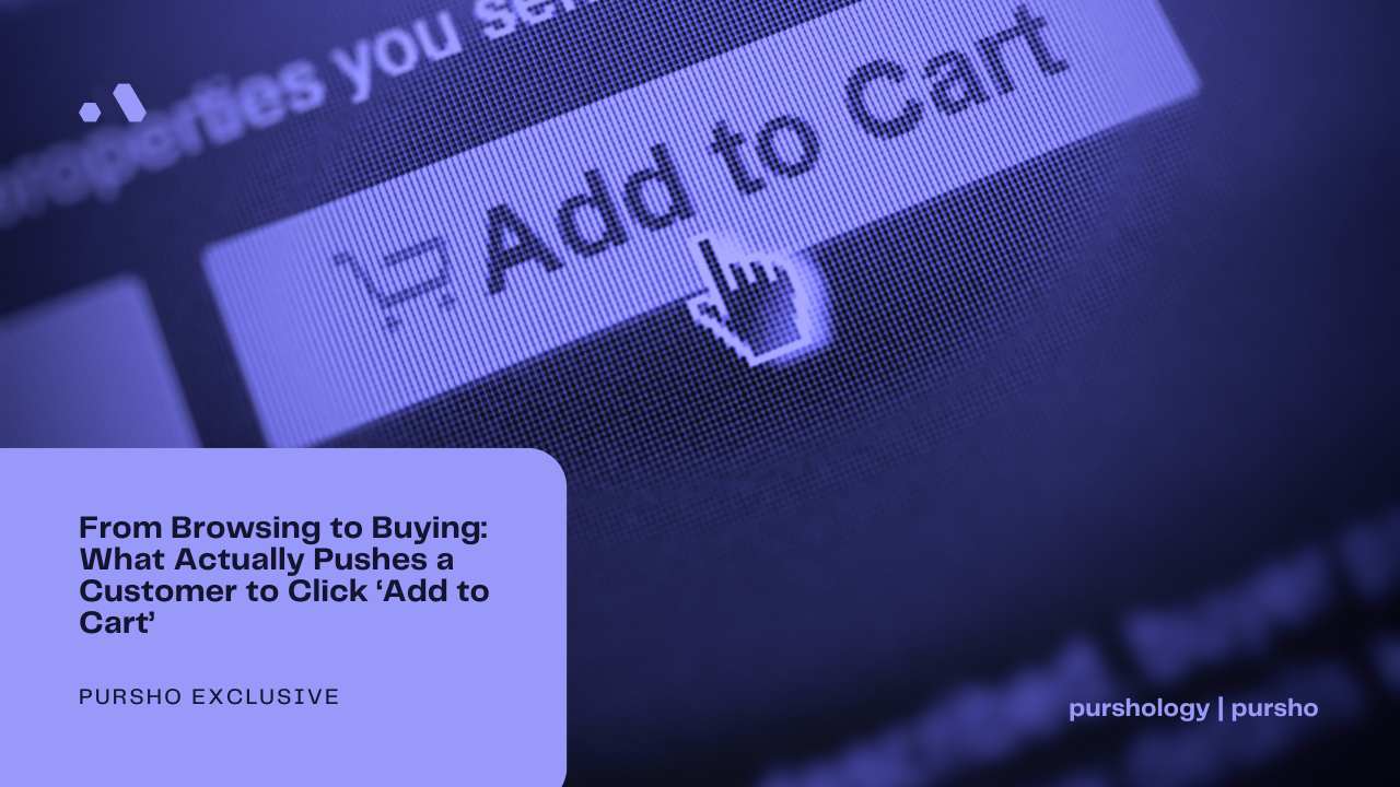
Every online store owner has observed the same painful pattern: a visitor lands on a product page, scrolls through the photos, reads a few lines, hovers over the “Add to Cart” button… and then leaves. Sometimes they never come back. Other times they return days later, only to abandon the cart again. The gap between browsing and buying is where most e‑commerce dreams die. But what actually pushes a customer to cross that gap? What psychological, visual, and technical triggers turn a passive browser into an active buyer?
The answer is not one single thing. It is a carefully orchestrated sequence of nudges, reassurances, and friction removers. This article breaks down the specific forces that make customers stop hesitating and finally click that button – from the moment they arrive to the split second before they commit.

The anatomy of hesitation
Before we can understand what pushes a customer to buy, we must understand what holds them back. Hesitation in online shopping comes from four main sources:
- Risk uncertainty – “What if this does not fit?” “What if the colour is different?” “What if the quality is poor?”
- Value uncertainty – “Is this worth the price?” “Could I find it cheaper elsewhere?”
- Effort uncertainty – “How long will shipping take?” “How hard is it to return?”
- Decision overload – “There are too many options. I will decide later.”
Every effective “Add to Cart” trigger is designed to reduce one or more of these uncertainties. The customer does not consciously analyse these factors; they feel them. Your job is to make them feel safe, confident, and slightly urgent.
Trigger #1: Visual proof that answers unspoken questions
The first thing a browser needs is to see the product clearly. Not beautifully – clearly. Many stores invest in artistic, moody photography that hides details. That is a mistake. High‑converting product pages answer the following visual questions without the customer having to ask:
- What does the product look like from the back? (Show a back view.)
- What does the fabric look like up close? (Include a macro shot.)
- How does it look on a real body? (Show on a model, ideally with multiple angles.)
- How does it compare to something familiar? (Show scale, or a model’s height and size.)
When a customer can mentally “see” themselves with the product, hesitation drops. The click becomes easier. One study found that product pages with three or more high‑quality images increased conversion rates by over 25% compared to pages with a single image. But quality is not enough – the images must answer specific questions. A shirt shown only flat on a table leaves too many unknowns.
Trigger #2: Scarcity that feels real, not manufactured
Scarcity works. “Only 2 left in stock” or “12 people are viewing this right now” creates a fear of missing out. But scarcity only works when it feels authentic. Fake scarcity – a countdown timer that resets every time you refresh – trains customers to distrust you. Real scarcity is based on actual inventory or genuine time limits (e.g., a seasonal product that will not be restocked).
For clothing, the most effective scarcity triggers are:
- Low stock warnings on specific sizes (“Only one left in Medium”)
- Expiring discounts (“Sale ends in 3 hours” – but only if true)
- Limited editions (“We made only 200 of these jackets”)
- Restock notifications (“Sign up to know when this returns” – this creates anticipation, not urgency, but still pushes action)
When a customer sees a genuine “only a few left” message, their brain shifts from “should I buy?” to “how fast can I buy?” That tiny shift is what pushes the click.
Trigger #3: Social proof that replaces missing information
Online shoppers cannot see other people buying the product in real time. They cannot see a queue forming. Social proof fills that gap. But the type of social proof matters. The most effective forms for pushing the “Add to Cart” button are:
- User photos – Seeing a regular customer wearing the garment kills the “will it look good on me?” doubt. A photo of a non‑model is more powerful than a professional studio shot.
- Specific reviews – Generic “great product” reviews are weak. Reviews that mention fit details (“I am 6’1”, 190 lbs, and the large fits perfectly”) are gold. They answer sizing questions directly.
- Purchase counters – “Bought 47 times in the last 24 hours” signals popularity. Popularity reduces perceived risk. If many others have bought it, it cannot be a terrible decision.
- Expert or influencer endorsement – Even a small mention from a respected voice in the niche can push a browser over the edge.
Crucially, social proof must be visible before the customer scrolls too far. If they have to hunt for reviews, the moment of hesitation has already passed. Place a summary of ratings and a few key review snippets right next to the “Add to Cart” button.
Trigger #4: A return policy that removes all risk
The single most powerful “Add to Cart” trigger for clothing is a generous return policy. “Free returns within 30 days, no questions asked” removes the biggest fear: getting stuck with something that does not fit. When a customer knows they can send it back for free, the purchase becomes a low‑risk trial. They click more easily.
However, the policy must be visible. Hiding return information in the footer or on a separate page defeats the purpose. The best product pages display return policy icons or a short line (“Free easy returns”) directly next to the price or the button. Some stores even add a checkmark icon with text: “Not happy? Return for free within 30 days.”
This trigger works because it changes the mental equation. Instead of “buy or not buy,” it becomes “try or not try.” Trying is much easier to say yes to.
Trigger #5: Price anchoring and perception of value
Price is always a barrier, but it can be managed. The “Add to Cart” click becomes more likely when the customer perceives they are getting a good deal – not necessarily a discount, but fair value. Tactics include:
- Compare‑at pricing – Showing a higher original price crossed out next to the sale price.
- Perceived value stacking – Listing what is included (“Free shipping, 2‑year warranty, gift box”).
- Cost‑per‑use breakdown – For expensive items, “This jacket costs $200 but will last 500 wears – that is $0.40 per wear.” This reframes the price as an investment.
These techniques do not trick the customer; they help the customer rationalise the purchase to themselves. Most people want to buy but need a logical excuse. Give them one.
Trigger #6: Urgency that is personal and specific
Generic urgency (“Hurry, sale ends soon”) works weakly. Personal, specific urgency works much better. Examples:
- “Your cart will be saved for 30 minutes” (used after adding an item, to encourage immediate checkout)
- “This price is for logged‑in members only” (creates a reason to register, which increases commitment)
- “Free shipping ends at midnight” (if true)
For clothing, size‑specific urgency is the most powerful. “Only 2 left in your size” – that is personal. That message converts browsers into buyers because it directly threatens the customer’s ability to get the item they want.
Trigger #7: Reducing decision fatigue at the last moment
Sometimes a customer hovers over the “Add to Cart” button not because they doubt the product, but because they are overwhelmed by choices: which size, which colour, which quantity. Too many options cause paralysis. To push the click, you must simplify.
- Preselect a default option – Choose the most popular size and colour. The customer can change it, but most will accept the default.
- Limit colour swatches – Show three to five colours, not fifteen.
- Use a simple quantity selector – Default to 1. Avoid “minimum order quantity” messages.
- Add a “one‑click buy” option – For returning customers, a saved payment method removes the final barrier.
Every extra decision adds friction. The moment the customer has to think about which shade of blue they want, the flow breaks. Remove as many choices as possible from the product page itself. Move complex customisation to a later step if needed.
Trigger #8: Trust badges and payment security
The final hesitation before clicking “Add to Cart” is often subconscious: “Is this site safe?” Trust badges (SSL, Norton, McAfee, or simply “Secure checkout” text) reduce this fear. So does showing familiar payment icons: Visa, Mastercard, PayPal, Apple Pay. If a customer sees their preferred payment method, they feel safe.
For clothing stores, a badge that says “100% Secure – your data is encrypted” placed near the button can lift conversions by 5‑10%. It is a small signal, but in the moment of decision, every signal matters.
The sequence: how triggers work together
No single trigger works on every customer. The magic is in combining them. A typical high‑converting product page might:
- Show clear, multi‑angle photos (reduces visual uncertainty).
- Display a bold “Free returns, 30 days” badge (removes risk).
- Include a user photo gallery (social proof).
- Show “Only 3 left in Medium” (scarcity personalised to size).
- Present a compare‑at price (value perception).
- Have a bright, obvious “Add to Cart” button (clear action).
- Show trust badges and payment icons right below.
This combination works because it addresses multiple sources of hesitation simultaneously. The customer never consciously thinks about why they feel ready to click. They just feel ready.
Conclusion: from hesitation to action
The journey from browsing to buying is a battlefield of small doubts. Every hesitation is a chance for the customer to leave. The “Add to Cart” click is the moment when trust, value, urgency, and simplicity finally outweigh fear. Successful stores do not leave this to chance. They systematically install triggers: clear photography, genuine scarcity, specific social proof, generous returns, price anchoring, personal urgency, simplified choices, and visible security. None of these is magic. But together, they create a psychological environment where clicking feels like the natural, safe, and rewarding thing to do. That is what actually pushes a customer to buy. Not one big thing – but a hundred small things lined up perfectly.

")
")