“Because I said so.”

Did your parents ever offer that reasoning to you when you asked a question? It’s infuriating, right? And yet on other presentation blogs I see a lot of “because I said so’s.”
Them: Get rid of bullet points in your PowerPoint presentations!
Me: Okay. Cool. But why?
Companies are offering up advice without showing the research that backs up their suggestions. That’s one of the things that makes Ethos3 different. When we share tips about how to improve your presentation design or delivery, those suggestions are based on empirical evidence and scientific studies. And we always do our best to link those.
Today, we’re offering 5 tips for better slide design which come straight out of Richard E. Mayer’s book Multimedia Learning. Mayer researched how students engaged with different multimedia components of a lesson and then tested their retention of the material. He created the following 5 principles for reducing extraneous processing based on what he found in his research.
Reducing Extraneous Processing in Your Slide Design
Okay, but before we jump into tip 1, let’s define that big term I just used: “extraneous processing.” Mayer says, extraneous processing is “cognitive processing during learning that does not serve the instructional goal—such as attending to irrelevant information or trying to make up for confusing layout.” In other words, it is busy work for our brains. And our listeners have to contend with extraneous processing when we don’t design and edit our presentation slides well.
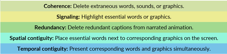
Tip #1: Coherence
The coherence principle basically says that we learn better when the presenter deletes unnecessary words, sounds, and graphics. His research showed this in 13 out of 14 tests. Here’s the kicker. Mayer found that principle is still true even when those words, sounds, and graphics are interesting. So that means something being interesting isn’t reason enough to include it in your slide deck. All elements should convey necessary meaning.
Tip #2: Signaling
In this second principle, Mayer found that in 5 out of 6 tests, learners who received a signaled multimedia lesson performed better on tests than those who received a non-signaled multimedia lesson. So what is signaling? It’s highlighting—telling or showing the listeners what to focus on. You can work signals into your slide design with the use of circles around content, a difference in color, or the use of other pre-attentive attributes.
Tip #3: Redundancy
The third principle says we should aim to “delete redundant captions from narrated animation.” His research showed that in 5 out of 5 tests, “learners who received graphics and narration performed better on tests than learners who received graphics, narration, and printed text.” So, it’s okay to show something on the slide and then tell us about it. It’s not okay to show us something on the slide and tell us about it while also asking the audience to read about it with words printed on the slide.
Tip #4: Spatial Contiguity
This fourth principle is all about space and layout. We learn better when corresponding words and graphics are in close proximity to each other. It’s one of those design principles that is so incredibly simple, but it’s also one that we need to be reminded of from time to time. The space between things is always communicating and active too. Remember, these tips are all about reducing extraneous processing, so if a listener has to work to tie the words and graphics together, or to form the connection between them, it results in brain busywork.
Tip #5: Temporal Contiguity
That last tip was about space, but tip 5 is about time. The principle of temporal contiguity says that we should always “present corresponding words and pictures simultaneously.” Mayer found that in 8 out of 8 tests, listeners performed better on tests when corresponding elements were presented simultaneously rather than successively. Here’s his explanation for why this matters: “When corresponding portions of narration and animation are presented at the same time, the learner is more likely to be able to hold mental representations of both in working memory at the same time, and thus, the learner is more likely to be able to build mental connections between verbal and visual representations.” When you present a piece of information as a 1 connected whole (say a graphic and a word), your listener remembers it together. If you present them on 2 separate slides, the listener now has 2 things to try to process and remember.
A Quick Review of How to Use Mayer’s 5 Tips in Your Slide Design

These 5 tips can help us elevate our presentation slide design with suggestions that are based on actual evidence. Try applying the principles of coherence, signaling, redundancy, spatial contiguity, and temporal contiguity to your next slide deck. Not because I said so, but because of research that helps us know so.
Ethos3 exists to help you tell your story with compelling narratives and stunning visuals. Find out more about our award-winning presentation design agency now.
The post 5 Tips for Better Slide Design appeared first on Ethos3 – A Presentation Training and Design Agency.
Looking For Powerpoint Design Agency?
Call Pursho @ 0731-6725516
Telegram Group One Must Follow :
For Startups: https://t.me/daily_business_reads
#Tips #Slide #Design

