by Adam Noar

PowerPoint decks usually contain at least one comparison slide (i.e., a slide that compares two or more things) to show how products or ideas are different. When it comes to these types of slides, your audience needs to QUICKLY and EASILY see how things are different That’s why it’s really important to improve your comparison slide design skills.
To get
you off to the right start, here are 3 tips to create a dynamic comparison
slide for your next PowerPoint presentation.
Let’s
begin!
#1. )
Pay Attention to your Colors

When creating a comparison slide you need to be very particular in your color choice. If you want to direct your audiences’ eye to are particular part of the comparison table you should make sure that the color of that section is different than the rest of the table. For example, as seen in the slide example below from the Simpl PowerPoint template, your eye immediately goes towards the “Pro” (Most Popular) section because its contrasting aqua blue color stands out from all the other grey options (basic, home, and ultimate).
Comparison slide example by Simpl PowerPoint template
#2. ) Use
“Check Marks & Dashes” Instead of “Yes or Nos”
As mentioned at the beginning of this article, when creating a comparison slide you want to make it as easy as possible for your audience to scan the differences between options. For this reason, opt for using checkmark icons to show that a particular feature is included and dashes “-“ to show that a particular feature is not included (as seen in the slide example below). Your audience will thank you for it.

Comparison Slide example by Space Template
#3. ) Show
the “high level” differences before getting into the details
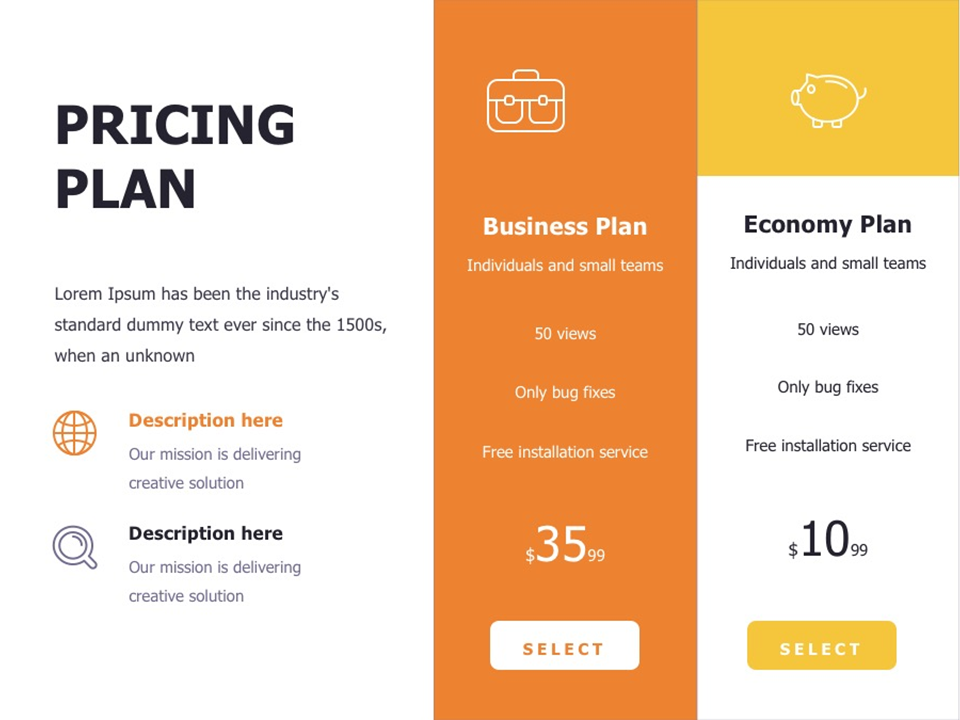
Before going into all the feature differences (as shown in the last example above), consider including a slide that simply mentions the high-level differences between options using a sentence or two (as seen in the example below). Again, applying tip #1, you can use color to bring attention to a particular offer you want to highlight on the slide. Then, you can create an additional slide where you can start to go into more details about what’s included for each offer (as seen in the second example below).


Comparison Slide examples by StartUp Template
Conclusion
I hope you’ve found these PowerPoint
comparison templates helpful in terms of understanding what a good comparison
slide looks like. If you want to fast track your comparison slide designs, keep
in mind that all the slide examples here are available for immediate download
on the Graphic River website.
Regardless of whether you are going
to download a pre-designed PowerPoint template or make your own keep in mind
that your presentation’s design needs to be SIMPLE.
Here is my question for you …
Which of the presentation tips mentioned in this post do you like the most? Do you have any tips to share when creating slides like these? Sound off in the comments below!

Looking For Powerpoint Design Agency?
Call Pursho @ 0731-6725516
Telegram Group One Must Follow :
For Startups: https://t.me/daily_business_reads
#Tips #Creating #Beautiful #Comparison #Slides #PowerPoint


