
As a business professional, you may be required to give a presentation at the spur of a moment. What would be the series of thoughts that would come to mind if you were on the hook for such an ask? Is the feeling of stress one of them? If so, you are not alone. Studies indicate 76% of individuals find it hard to translate your ideas into a compelling deck that creates an impact and engages the audience?

As an audience, we frequently endure dull business presentations that include a lot of content and are poorly designed.
Granted, a good presentation is more than just the presentation design. There’s your public speaking skill, your ability to connect with your audience, and your understanding of your topic.
Yet how well a presentation is made is of tremendous importance since it ensures that you have done proper preparation and thought deeply about what the audience cares about. A good presentation takes time and effort to build but it’s worth it.
Why is Presentation Design Important?
A presentation is much more than a stack of slides with text and graphics on them.
A robust Presentation design combines your ideas, narrative, graphics, facts, and statistics into one unified storyline that leads your audience to the conclusion you want them to reach.
When you create a presentation with good design, you have the potential to convey your point of view, grow adoption of your ideas, and get your audience to see and hear your vision loud and clear.
And creating such a design is neither abstract art nor is it rocket science. If you don’t have a ready skill or access to a professional designer, don’t be anxious!
We’ve put together a beginner’s guide to help you understand the different types of presentation designs, as well as some fantastic design tips.
Let’s get started.
10 Beginner’s Tips For Designing A Compelling Presentation
To ease you into the art of presentation design we’ve got ten tips that you can start implementing right away.
Tip #1: Don’t Flood Your Slide With A Lot Of Content
As an effective presenter, you are not likely to be reading directly from your slides. As such include just your essential points and must-know data on your slides. Your speech fills up the rest.
This not only makes your presentation more attractive as a whole but also enhances your presentation design.
The presentation with minimal text appears much superior to the one with loads of content.
Tip #2: Always Stick to 2-3 Fonts and Colors
Our next tip focuses on the typography and color scheme of your presentation. While it may be tempting to include as many different fonts and colors as possible, you should limit yourself to two or three.
Your fonts and colors should also have a purpose. Select one font for the headers -usually the bolder version of the one you use for the body content.
Your color selections should vary based on what you are trying to communicate. A complementary color scheme is a fairly popular and safe choice for many situations. Use one or two primary colors throughout, with an accent color tossed in for good effect. Make sure your colors complement one another and serve to express the right message when using the complementary scheme.
If you use too many font styles and colors on your slides, it will look cluttered. It will make it hard for the audience to focus on the main message you are trying to convey.
If you are interested in learning more about how to use colors and fonts in presentations, please refer to the Vision Science section of the SlideUplift blog
Tip #3: Pay Attention to Visual Hierarchy
While adding text to your next presentation, keep visual hierarchy in mind. This essentially implies that the sequence in which the content is read on your slide should be clear, based on font size, color, or weight.
If the visual hierarchy of your slides is messed up, then it will leave your audience confused throughout the presentation. Paying attention to visual hierarchy will ultimately make your presentation easy to understand.
Tip #4: Use Graphic Elements To Make Your Presentation More Appealing
Visual elements can enhance the impact of a presentation. Consider stock images, iconography, illustrations, videos, and even charts and graphs. All of these elements can help you improve the design of your presentation.
You should also ensure that your images accurately portray the content of your presentations. Alternatively, if you don’t have any words on the slide, make sure the visuals accurately represent what you’re saying in your presentation.
Visuals should always complement rather than distract from your presentation. Therefore, incorporating engaging and high-quality visuals in your presentation helps your audience visualize the words on the slide.
Tip #5: Make Your Text Clearly Readable
One major mistake we often notice in presentation design is failing to employ color contrast to make your text stand out. By the use of complementary colors, the text is frequently lost or mixed in with the backdrop.
While staying within the limits of a color palette is a good idea, you should use contrasting backgrounds and font colors to make your text stand out to the reader for a better and clear understanding.
Tip #6: Use Animations Sparingly
Sometimes we see presentations that employ animations extensively- to the point it appears gimmicky and takes focus away from the main message. We recommend using animations sparingly and when used, sticking to one animation style throughout the presentation.
Too much animation or too many different animation styles can confuse your audience
Tip #7: Make Sure You Highlight The Key Points
Using shapes, accents, characters highlighting the key point or content fragments is a great way to showcase your core messages
This not only helps to hold the reader’s focus on the page, but it also makes your presentation design look more attractive by carrying visual variety in the deck.
Tip #8: Incorporate Data Visualization
When displaying figures and statistics in your slides, another presentation design tip is to use proper data visualization techniques.
This can range from a bar graph or pie chart that represents different forms of data in a chart or graph to a percentage radial or a pictogram that brings numbers to life. Which graph you use depends on the nature of the information you are trying to present. For example, line graphs are often used to showcase trends. Scatterplots are used to show how two things may be related. Pie charts are a great way to show compositions within a larger topic. You can refer to the SlideUplift blog to learn more about using proper charts and the best practices associated with them. Using charts and graphs smartly helps make complex data and statistics easier to understand for the audience
Tip #9: Maintain Consistency Throughout
Each slide in your presentation should have a consistent design and effect. You need to keep the design consistent so that your audience understands that your slides go together and that you’re still discussing the same topic.
Maintain a consistent design to create a coherent, cohesive presentation.
Tip #10: Keep Your Presentation Notes Separate
Your presentation notes should not be written directly on the slide for anyone to view. This will make your slides very busy
You should save your presentation notes in the notes section so that you can be confident that all of the information you need for each slide is properly saved and easily accessible
As previously stated, your main presentation should only include your main idea, a few supporting statements, and visuals.
Amazing Templates To Design A Compelling Presentation
Finding an appealing presentation template relieves you of the burden of following detailed rules for creating a compelling presentation.
Are you ready to put some of these presentation design tips into action?
SlideUpLift has hundreds of customizable google slides templates to get you started!
Here are some of the most popular presentation templates for creating a compelling presentation:
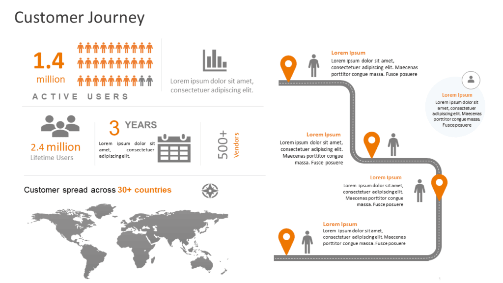
Customer Journey Executive Summary
Source: Customer Journey Executive Summary by SlideUpLift
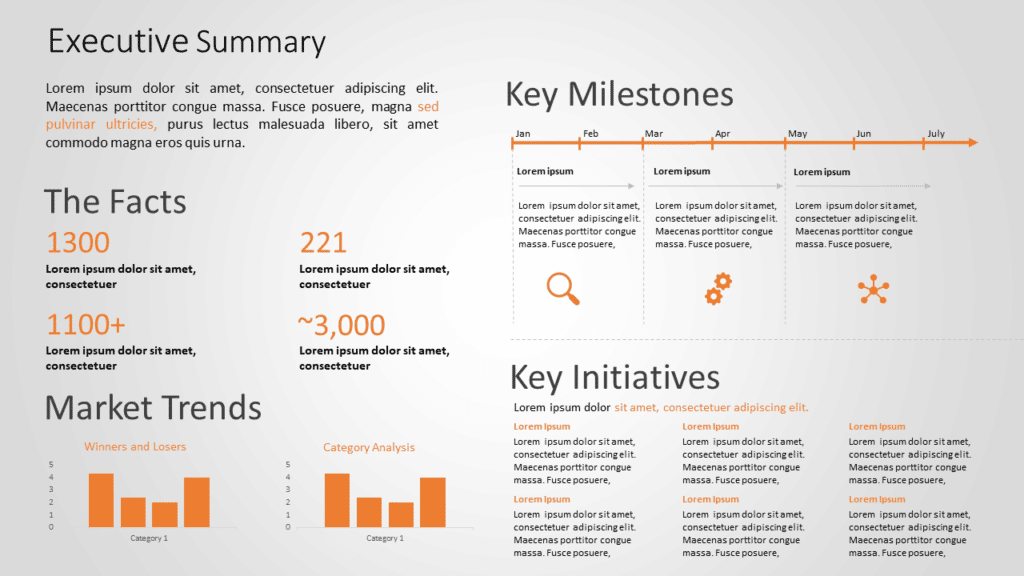
Executive Summary
Source: Executive Summary by SlideUpLift

Project Kickoff
Source: Project Kickoff by SlideUpLift
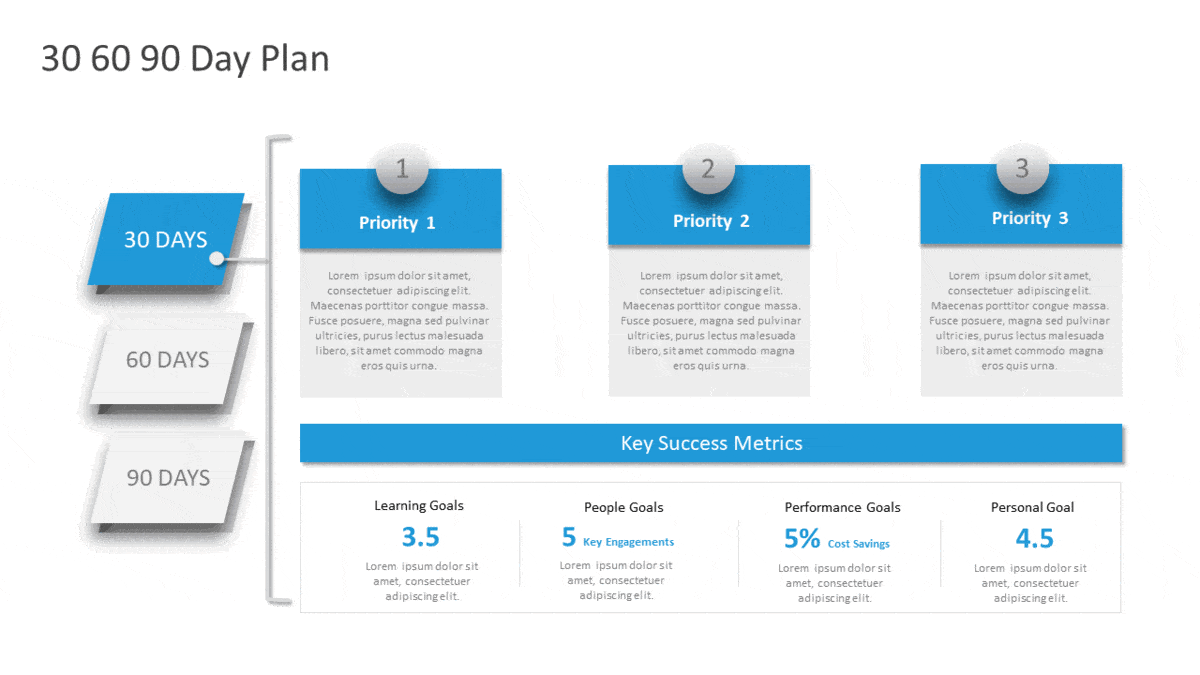
Detailed 30 60 90 Day For Managers
Source: Detailed 30 60 90 Day For Managers by SlideUpLift
Wrapping It Up
It is not easy to create a well-designed presentation, but believe us when we say it is well worth the effort. A compelling presentation can help you communicate successfully with your audience, promote your company, and attract new clients or investors.
Use the tips mentioned above the next time you make a presentation to provide a clear, visually stunning message to your audience. If you are really looking forward to a presentation design to wow your audience, it’s a good idea to use easy-to-edit presentation templates by SlideUpLift!
Now you don’t have to scour the web to find out the right templates. Download our PowerPoint Templates from within PowerPoint. See how?
Looking For Powerpoint Design Agency?
Call Pursho @ 0731-6725516
Telegram Group One Must Follow :
For Startups: https://t.me/daily_business_reads
#Build #Great #Presentations #PowerPoint #Google #Slides #Beginner #Tips

