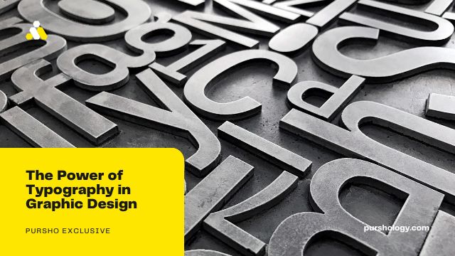
Typography is but one of many types of graphic design that is welcome within the online stock industry. Typography can attract attention to your ad or web page, be artfully pleasing, or even evoke an emotion. Even back in the days when monks would copy the Bible by hand, the type and graphics were a work of art beyond being a holy task of passing on a particular belief.
Even when Gutenberg began printing the Bible and other material, much thought was given to the typeface and style of font. This blog too uses typography. While there is no control when submitting blogs to Dreamstime in regard to font and font size, there still is some thought put into breaking up the text into paragraphs. Everyone knows that continuous text is hard to read and uncomfortable to the eye. Your language teacher may have given you rules for when and why to start a new paragraph but paragraphs are greatly appreciated and a function of typography.

Style, therefore, matters!
If can search the internet for typography theory for the how and why of selecting fonts, breaking up type on a page, hierarchy for text on a page, and so on, but here at Dreamstime, we’re going to be more interested in using typography for graphic design.
As stated, the font itself can evoke feeling or emotion. A simple graphic with the text PANIC ATTACK, what kind of font will you use? To help evoke that emotion you may choose a font that is jittery looking and uneven. You might use a different font size for each character to help make it appear disjointed. What colors would you use for the font and background?
Another design might use the words PEACE AND LOVE. It’s likely you might use a cursive type of font, one that is smooth and curved. These two examples are practically already known by everyone because we’ve been conditioned to expect such fonts and designs to portray these types of feelings. But there are fundamental elements of being human. The world is a smaller place now but in the past when all corners of the world were being discovered, cultures unknown to each still understood smiles, frowns, aggression, and love. Typography could be an extension of our basic DNA and certain styles are universally accepted for communicating emotion and feelings.
Being aware of this will be important if you use typography in your designs.
Words alone can be used to create a design such as arranging words and text in various shapes. This creates an eye-catching graphic and that’s another important element when creating images for your portfolio. Buyers want images that grab the eye and give attention to their ad, product, opinion, or presentation.
Another common design is a word cloud where words are both horizontal and vertical and mixed together. Different fonts and sizes may be used but all the words will be related. A set of words could include depression, sadness, loneliness, anxiety, and so on. The final design might be used for a suicide prevention ad.
A popular design is to use words to create a portrait of a face. If you go to YouTube and search on TYPOGRAPHY FACE, you will find videos on how to do this. A typography face would be a powerful addition to your portfolio and hopefully would generate sales.
As you can see, learning about typography and how to use typography in your graphic design concepts is a way to expand your portfolio and go beyond what the average contributor submits. The online stock industry is sink or swim so you need to find ways to stay ahead of your competition. Do some internet searches, learn more about typography, and find tutorials for creating typography graphics that may help your portfolio generate more sales.
Stock photos via Dreamstime.com

