Powerful tools can translate millions of data points into comprehensible information, revealing patterns and trends that are vital in any industry, especially in finance. One such powerful tool is the bar chart. While simple in design, bar charts provide insightful representations of data for an array of applications in the financial sector. The following sections explore these applications, the bar chart’s benefits, its usage in stock analysis, and its real-world applications in financial analysis. To learn more about the answer to the question “What are bar charts?” keep reading.
Understanding the Basics of Bar Charts
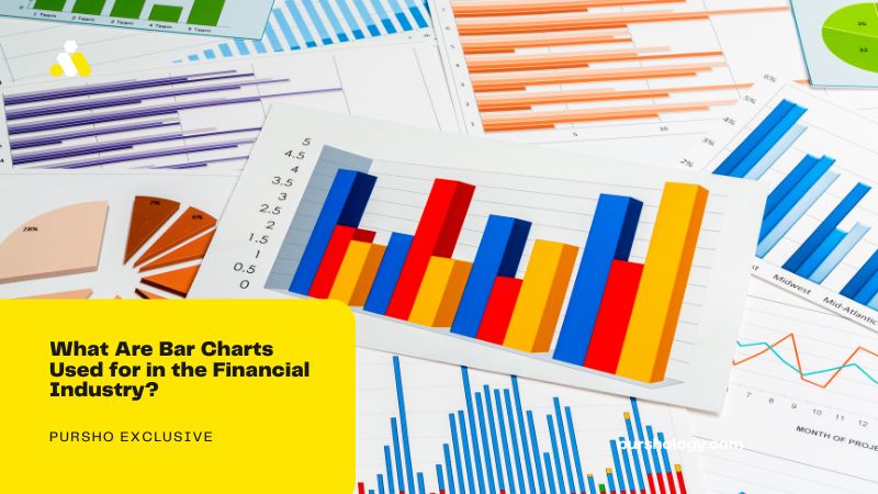
Before delving into the intricacies of bar charts in the financial industry, it’s essential to understand their basics. Bar charts, also known as column charts, are among the most commonly used tools for representing data. Simply put, they are a visual depiction of data where the length of the bar represents the measure of frequency or amount.

Bar charts can be displayed in both vertical and horizontal formats and can be useful for comparing data across categories. They portray the differences between groups or track changes over time in a way that is quickly and easily understood by the viewer. Moreover, they cater to various ranges and can scale to accommodate large datasets, making them ideal for representing financial data.
Understanding the basics of bar charts sets a foundation for their application in the financial industry, which often involves complex and vast datasets.
The Essential Role of Bar Charts in the Financial Industry

Bar charts play a pivotal role in the financial industry, as they assist in making sense of the vast amounts of financial data generated daily. By visualizing this data, financial analysts, investors, and decision-makers can discern patterns, compare performances, and make educated decisions.
For instance, bar charts are widely used in comparing the financial performance of companies, countries, or financial instruments. The visual nature of these charts allows for quick comparisons and draws immediate attention to significant discrepancies.
Furthermore, bar charts are also commonly used in tracking changes in financial data over time, such as tracking a company’s revenue or expenses over several years. This allows stakeholders to quickly gauge a company’s financial health and historical performance.
In essence, the significance of bar charts extends beyond mere illustration—they hold value in decision-making, strategy development, and forecasting in the finance sector.
Gaining Insights From the Bar Chart’s Colors in the Financial Industry

In addition to the length and position of bars, the color of bars in a chart also carries significance in a financial context. Most commonly, in the realm of stock market analysis, different colors can identify rising and falling stocks or indicate specific patterns of market behavior.
Typically, a green or white bar indicates that the closing price was higher than the opening price, suggesting a bullish market. Conversely, a red or black bar signifies a bearish market where the closing price is lower than the opening price.
By conveying such critical information, the color-coded bars aid investors in discerning market trends more effectively, subsequently facilitating profitable investment decisions.
Therefore, colors in bar charts play an integral role in financial market analysis, further accentuating the charts’ importance.
Overall, the role of bar charts in the financial industry is undeniable. Their ability to present and compare vast amounts of complex financial data succinctly makes them indispensable in the sector. From basic comparisons to in-depth stock analyses, bar charts empower financial stakeholders with the critical insights required to make informed decisions.
")

")