Designers are geniuses—they’re able to take an idea in your brain and turn it into a beautiful reality. But if you’re on a shoestring budget, design resources might not be in the cards. That means, just like with many other aspects of your business, you’ll have to start by doing it yourself.
That’s what I did a few years back, and I picked up some tips along the way that I hope will help you create the brand identity you’re going for.
Designing for social
Building a recognizable aesthetic is crucial for new businesses, and social is the best place to share that identity. That means consistency is key.
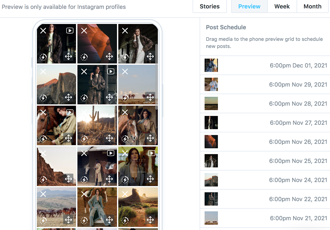
While planning the content for Bastet Noir’s Instagram feed, I focus on consistency. Even if each of our images isn’t perfect (which it won’t be!), the feed needs to make sense. One way to check for this is using a social media management tool.
We use Later to schedule our posts, and we preview them all together to make sure the aesthetic is consistent.

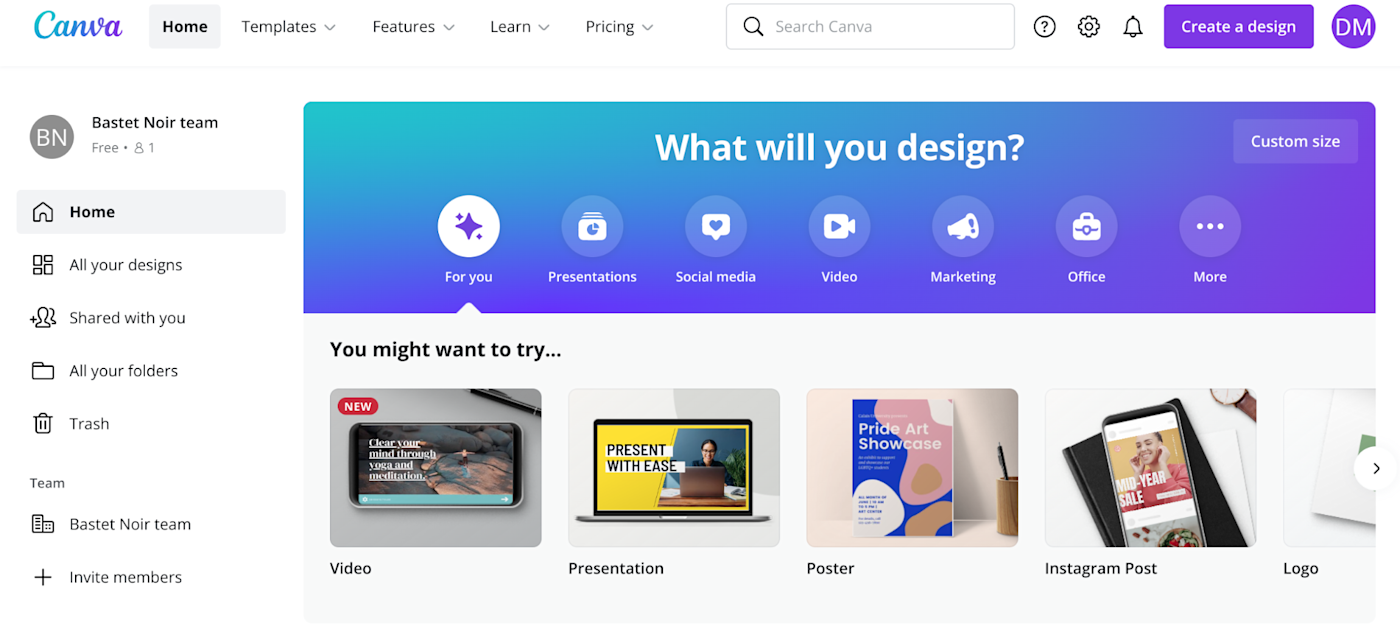
If a certain photo doesn’t fit with the rest, we use Canva to adjust the colors, exposure, contrast, and sometimes even the tint. Canva is one of many excellent graphic design tools for social media: it’ll turn your amateur design skills from basic to professional in a matter of seconds.
Canva has pre-designed templates you can use for almost anything visual, as well as pre-defined formats for basically every type of social media imaginable (and most of what you’ll need is included with the free package).

To make things easier, we also have several pre-defined filters on Canva that we use to give photos our unique vibe. And here’s a little hack I learned: add a transparent layer on top of every photo to make them look a bit more polished and toned-down.
Make sure your font and text sizes are consistent, too. We use three different font sizes: one for headings, one for subheadings, and one for our slogans (“Because we give a damn” and “Changing our society for the better”), which go on every photo we put in our Instagram stories.
With these simple tools and tips, you don’t have to reinvent the wheel every time. Plus, you can do things like take user-generated content from Instagram and still make it match your aesthetic.
Designing for email
Just like with social, your emails need to be consistent. That’s why I recommend you start with a template.
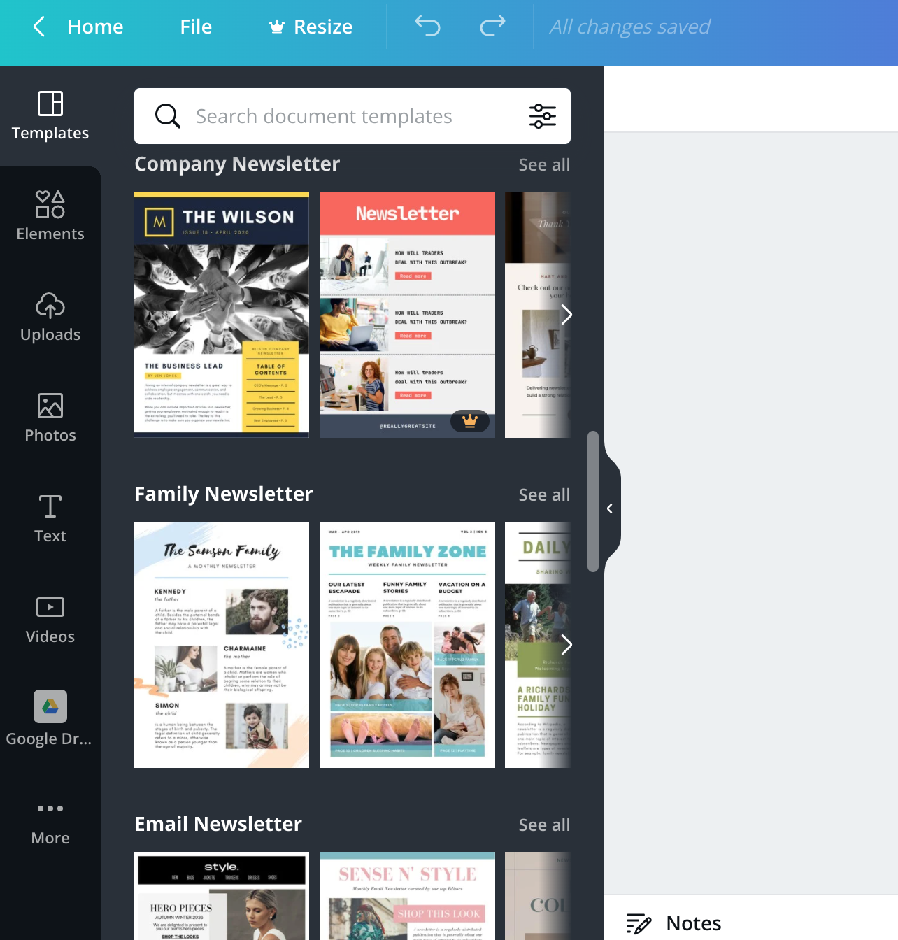
Most email newsletter tools—even the free ones—will offer loads of templates, but we actually use Canva for that too: it has templates for almost any industry imaginable. So you can start there and then adapt to your brand aesthetic.

Use your brand’s colors and fonts, incorporate your logo, and make sure the font size is consistent every time. The more familiar your emails feel to a customer, the more likely they are to keep opening them. If you segment your audience—which we do, using Mailchimp—each audience might get slightly different designs, but they all need to match your core brand aesthetic.
Another mistake non-designers tend to make is using too many words. People are overwhelmed with information, so the more you can say visually, the better. And when you do need to convey information with words, be concise.
Designing for product photos
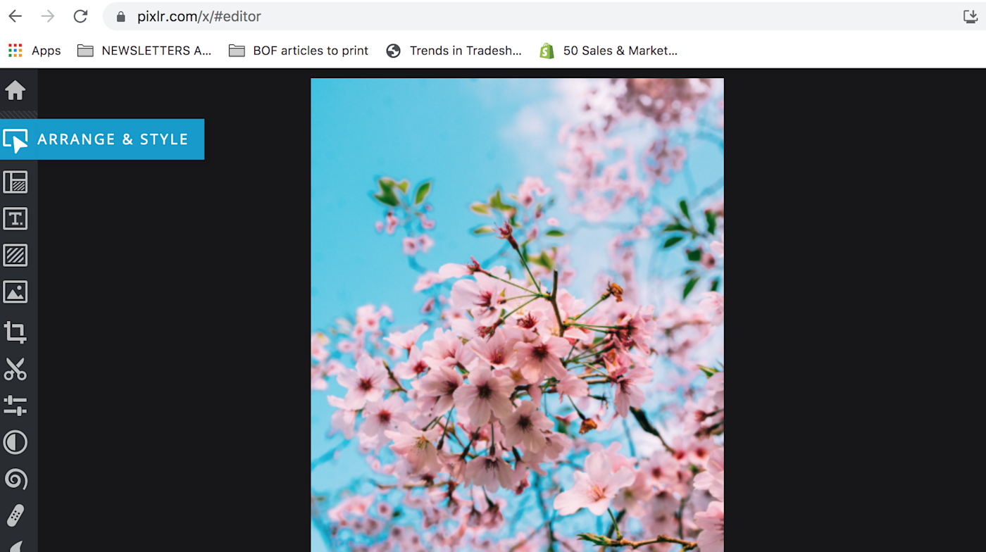
For product photos, we use Canva, where we have pre-defined filters specifically made to suit the aesthetic of the label. We’ve also used Pixlr, which is sort of made to simplify the Photoshop experience. It has a lot of the options that Photoshop has but without the complexity that comes with really powerful software.

Most of the retailers we work with use the same product photos we do (clothes on a model), but some require us to have packshot images ready. That means we need our products to be separately shot on a plain white background without a model. I always dreaded the moment when they’d ask for these types of images because it meant that we needed to reshoot the entire catalog of items we had.
Turns out there’s a tool for that too. We use Clipping Magic, which removes the background from any photo. This comes in massively handy for us, and if you’re looking to create a simple product photo, it can be the key to making it look professional.
Down the road, you’ll definitely want to hire a designer—they’re the experts. But if you’re just starting out and don’t have the resources, these tools will work in a pinch.
Need Any Technology Assistance? Call Pursho @ 0731-6725516


