
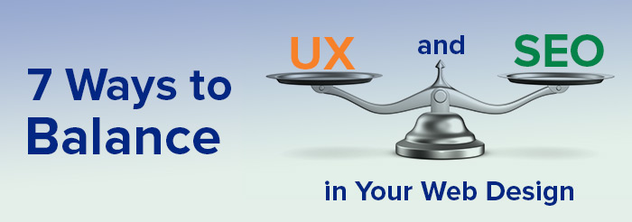

Right now, there’s a tremendous battle raging on the Internet and you probably haven’t heard a peep about it. It’s the battle between search engines (SEO) and user experiences (UX).
Why? Because the best practices in SEO can often diminish the user experience. For example, while SEO demands longer content enriched with more keywords, your users may prefer less content, more white space or larger, more readable text. That’s the most glaring example of UX design and SEO being at odds. At the end of the day, your web design should appeal to humans and search engines alike.
In this article, we’ll discuss the best ways to balance SEO best practices with user experience and end this battle once and for all. Here are seven great ways to balance your appeal to search engines while still delivering a world-class user experience.
1. Find creative ways to present your content
Perhaps the biggest battle between SEO experts and UX strategists is over the amount of content to have on a web page. You need enough content to help search engines understand what the page is about, but you also need to be clear and concise enough so that your visitors stay engaged without feeling overwhelmed.

If your page calls for a lot of content, you can get creative about where and how you arrange your information. The first 4 to 5 sections of your home page should correlate to the most important pages on your site. Web visitors tend to scroll on websites and it’s common for a visitor to scroll the home page and use it as a guide to your internal pages. After these main panels on the home page, you can add a few more sections with less essential but useful content in order to increase the amount of content on the page, if necessary.
On an internal page such as Frequently Asked Questions, you can use an accordion style to add more content while keeping the page clean and easy to read. The accordion shows the questions and only opens up to reveal the answers when a visitor clicks on either the question or a plus symbol. It’s a user-friendly solution that keeps the content searchable for SEO as well.
2. Be strategic with your headers, subheads and calls-to-action
These so-called high-level messages serve two functions: They anchor and guide your visitor’s attention through the site and they support your on-site optimization, which makes them a great place to start.
For UX, web designers typically use a visual hierarchy. They arrange the graphic elements of a page in order of importance. This visual hierarchy will influence the order in which the human eye perceives information. Headline texts known as H1s are typically in the largest or boldest font, with subheads in slightly smaller fonts. This helps your web visitors to process information quickly as they scan your page.

For SEO, the main headline on a web page is typically the H1 tag. H1 is an HTML tag, typically written as <h1>, that indicates a header to search engines. Before writing your page headers, subheads and calls-to-action, do your keyword research and think about the focus of each page. Include keywords in your headers while keeping the language clear and readable. Your visitors will know the difference between helpful, informative headers and overstuffed, keyword-loaded headers that were written solely for SEO.
3. Make sure your web design has clean navigation
Having clean, intuitive navigation is critical to creating a positive user experience on your website. If a web visitor has difficulty navigating your website, they’ll leave quickly and never return. Older websites were typically designed with lots of pages to navigate because most visitors were viewing sites on desktops and clicking through drop-down menus.
Today, however, the vast majority of visitors use smaller devices such as tablets and mobile phones. They expect to find what they are looking for quickly and easily. Your SEO goals may require lots of pages on your website, but your UX goals will require fewer of those pages to be included in your navigation. Also, avoid too many drop-down menus because they’re difficult to navigate on mobile devices.
4. Focus mainly on the mobile user
The good news is that SEO and UX are slowly converging for the mobile user experience. Since 2015, when Google announced the move toward mobile-first indexing, the mobile version of your website has become more dominant for both indexing and ranking. Now that mobile-first indexing is dominant, you should prioritize the mobile experience of your site for both SEO and UX.

Think in terms of adding content in strategic ways that optimize the mobile user’s experience of your site. It will help to work with a web design agency that is skilled in mobile design.
Keep in mind that the placement of objects and use of white space are critical on mobile devices because visitors tap buttons or links with their thumbs. If objects are placed too close together, your site will be difficult to navigate for mobile users.
We’ve all seen people walking and looking down at their phones. That’s why creating an intuitive navigation and user experience is so important to mobile – your visitor may be distracted while they try to navigate your site.
5. Use a responsive web design
A responsive web design is one that automatically adjusts itself to the device it’s being viewed on. It provides the same user experience whether you view it on a desktop, laptop, tablet or mobile device. Since Google made it mandatory for website owners to go mobile-friendly, you may face their wrath in your rankings if you don’t. Today, having a responsive healthcare web design will give your site a boost in the rankings.

6. Avoid too many images
Images are an excellent way to attract your audience and convey whatever message you’re trying to share. But there is a limit to how many you should use on one web page or blog post. You may be surprised to know that, according to Moz, text-only pages actually rank much better than image-laden pages, especially if the images you use are generic stock photos. If you’re going to use imagery on your pages, make sure it’s relevant to the focus of your page and includes keywords in the image titles and alt-tags to improve your ranking.
7. Last but not least, ALWAYS favor your user
If you focus your web design on appealing to search engines, you may fail to attract the patients you want. Your number one focus must be on the end-user’s experience. Remember that Google and other search engines want to help users find you.
Unfortunately, some practices mistakenly design websites that are SEO friendly but utterly lacking in user-friendliness. Keep in mind that Google changes its algorithms frequently and is becoming smarter every year. So even if all of your UX design elements aren’t quite SEO-friendly now, they may be in the near future. Just do whatever you can to make your site search-engine-friendly as well.
The web design that will represent your healthcare practice is too important to be overlooked. It’s your practice’s image on the web, so make sure it’s as enticing to visitors as possible. If you have any doubts, you can use a reputable SEO services company or a web design agency to help you create a site that is both SEO and UX friendly.
Looking For Healthcare Marketing Agency For Hospitals , Clinics, Doctors?
Call Pursho @ 0731-6725516


