Your boss requested an urgent report that shows the trends of key metrics in Google Analytics. You need to locate the data and create a few charts. What kind of charts should you choose? What colors should you use? Should you create a dashboard? Or maybe a story?
An understanding of data visualization informs all of these decisions. Here are three books to get started.
Essential Data Visualization Books
Storytelling with Data by Cole Nussbaumer Knaflic

Storytelling with Data
“Storytelling with Data” ignited my passion for data visualization. The book is accessible for beginners and is structured around six key data visualization concepts:
- Understand the context,
- Choose an appropriate visual display,
- Eliminate clutter,
- Focus attention on where you want it,
- Think like a designer,
- Tell a story.
Each chapter covers one data visualization lesson and includes many simple, practical examples, as well as step-by-step instructions. “Storytelling with Data” provides an excellent foundation to prepare for advanced data visualization topics. A key passage in the book:
What do you need your audience to know or do? This is the point where you think through how to make what you communicate relevant for your audience and form a clear understanding of why they should care about what you say.
—
Avoiding Data Pitfalls by Ben Jones

Avoiding Data Pitfalls
Too often, we think of data visualization only from a design perspective. However, the design process is the middle step. We first need a clear understanding of the data itself. “Avoiding Data Pitfalls” is a helpful resource to increase data literacy. It’s an easy read, packed with examples. The author provides a structure for thinking about data and avoiding seven common pitfalls:
- “Epistemic [knowledge] errors,”
- “Technical trespasses,”
- “Mathematical miscues,”
- “Statistical slipups,”
- “Analytics aberrations,”
- “Graphical gaffes,”
- “Design dangers.”
Here’s a favorite paragraph in the book:
But when is a given data set clean enough? Like a kitchen countertop, it can always be cleaner. We hit a point of diminishing returns in our preparation of any data set, though, where more elbow grease and scrubbing doesn’t yield sufficient incremental benefit to warrant the time and effort.
—
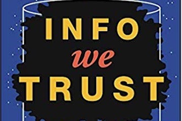
Info We Trust by RJ Andrews

Info We Trust
What comes after a visualization — the storytelling piece — is just as essential as the data before it. “Info We Trust,” published in 2019, teaches data storytelling. The book does not include how-tos. Instead, it convinces the reader that data is beautiful. The book provides a deep understanding of why and how we tell stories with data — addressing history, philosophy, and human psychology. The book also contains fascinating illustrations, all drawn by the author.
“Info We Trust” is a dive deep into the art of storytelling. It’s unlike any other data visualization book.
Here’s an excerpt:
To harness data, the world needs information: more information, better information, more complex and more nuanced understanding, and better narratives that can show ways for all to flourish. […] To be a data storyteller is to be a creator, a maker, a constructor. We do not just make information, but new and enthusiastic visions of how things are and how they might be.
Broad Perspective
The three books provide a broad perspective and a deeper understanding of the craft and science of data visualization. “Storytelling with Data” addresses design aspects. “Avoiding Data Pitfalls” stresses the importance of understanding the data. And “Info We Trust” explains the importance of data storytelling.


